Of all the philosophies and theologies I have learned, the most difficult is the idea of impermanence. Think, Buddhism and Hinduism.
Most people have heard about or witnessed the creation of Buddhist sand mandalas. On the other hand, few have witnessed the erasure that follows. The erasure is a ceremony unto itself, symbolizing the temporary place that we and all life on Earth hold.
Over the years, much to my dismay, several of my murals have been painted over. I had hoped they would remain until long after I had passed. I have learned to accept some of this impermanence, mostly because there’s usually another commission or gallery opening just around the corner. Still, I yearn for some kind of immortality through my art.
My first restaurant mural actually had a long lifespan. I had decorated all four walls of a local Italian restaurant. The less-oft’ viewed back of St. Peter’s Basilica; the crumbling Coliseum; romantic couples in gondolas with laughing children racing across the bridges overhead; horses sporting brightly colored headdresses, pulling equally bright Sicilian carts; an Italian phrase that echoed our oft recited, “Eat, Laugh, Live,” (and which I had to research with help from the local university); and even the iconic fingertips of Michelangelo’s “The Creation of Adam” over the dessert freezer (what more appropriate spot?).
For years, my family, friends and locals reveled in the authenticity of the Sicilian family’s recipes, with my artwork as a backdrop. But the neighborhood changed. Mama Lina’s closed its doors.
A couple of weeks later, perhaps with a touch of masochism, I stopped by. A half-dozen white, work trucks were parked outside and the sound of drills and hammers echoed throughout the empty space. I walked through entryway, once decorated with a vine-covered lattice arch, to see only whitewashed walls. Stark. Eerie. Depressing. Almost dreamlike, in a nightmarish sort of way.
As I stared at the blank spaces that had once danced with life, workmen came up to ask me if I was the artist.
“How did you know?
“The way you walked straight in and stared at the wall,” one of them said. Of course. Who else would walk into someone else’s business, uninvited, and stare at all the blank walls? They were sympathetic, and even asked for my business card. But they had a job to do.
Another restaurant hired me to paint numerous Egyptian scenes on wood-stained clapboard—no easy feat. I first had to prime the area. While that was drying, I sketched scenes from various internet travel sites, merging each as it moved along the wall. The iconic Egyptian pyramids; sparkling gardens and lush, tropical flowers; women carrying basketsful of fruit atop their heads; and a twist on the traditional, tourist camel ride—the owner and his family atop the camels. Each family member posed, an exercise that added many hours to my work.
They did a good business for a while. But the location never stuck. Attempts to make it into a nightclub flopped. I heard rumors that they may close and so I made a trip over, only to find the camel scene marred. Someone had whitewashed the family’s faces. I never returned to witness the complete erasure.
Admittedly, I have destroyed some of my own artwork. My skills have improved. Some items were water damaged. And I don’t need three portfolios of college work. Still, my stomach does a little flip each time one of my works ends up in the landfill or hidden beneath four coats of Kilz.
All things have a lifespan. Cars. Buildings. Glaciers. Magazines. Medicines. And, of course, humans. I have, through necessity, adopted a more laisse faire attitude toward the sometimes-transient nature of my work.
And when I hit a real low, I pick up my brush and start again. I can always create something new.
When I was little, my dad worked in the printing and publishing business. Later, he started his own small print shop. He brought home big, boxed paper samples for me to draw on. Different sizes, weight, texture and opacity. Dad showed me the difference between cover stock and card stock, and named all the colors—much different than my Crayolas. “Canary yellow” and “Salmon” were specific in those days to paper. My father knew that the gift of paper would be far more appealing than a new Barbie.
Among those samples from Northwest Potlatch Paper Company were beautiful prints of Canadian Mounties astride their horses, often alongside muscled Native Americans astride their own steeds. Every now and then, a print would feature a Mountie playing with huskies.
To a nascent artist and animal lover, this was heaven. I sat on the living room floor and sorted through the papers over and over again, deciding which to color on first. I studied every detail of the printed images, drinking in the evocative vistas and adventures. The experience reinforced my interest in art (not to mention dogs and horses). It also puffed up my chest a bit, since we lived in Minnesota and the images were just like “home.”
Of the 16 artists hired by Northwest, the artist whose work I distinctly remember was Arnold Friberg. He was the most prolific of the artists commissioned by Northwest (Potlatch) Paper Company, so it’s no surprise that his work showed up most often in the boxes my dad brought home. Over the course of 33 years (between 1937 and 1970), he sold paintings or reproduction rights on 208 Mountie subjects to Northwest Paper. Friberg was also well known for his Western and Biblical illustrations. The latter interest led to a monumental painting and costume design project for Cecil B. DeMille’s film The Ten Commandments, which earned Friberg an Academy Award.
His style was distinctly representational and overtly masculine. Men and horses alike boasted chiseled jaws and soulful eyes. Postures were perfect. Manes and tales ripped across his oil paintings in a deft display of motion, while the implacable Mountie sat strong and tall. He was the yang to Norman Rockwell’s yin, but their styles were similar, in that their subjects were both heroic and routine. No surprise, they studied together in New York before WWII.
Friberg’s narrative (most likely assigned by Northwest Paper management) ranged from Mountie as rugged outdoorsman (warming himself in the shadows of the night by a small, hand-made fire, snowshoes upended and wedged securely in the snow); to upholder of the law for Native Americans (victims of cattle and horse rustling); to Mountie as proselytizer (reading the Bible to a group of Native American children); to something of a cross between mom and handyman (reattaching the arm of a doll for a Native American girl). Always, binoculars and a map were at hand. Northwest Potlach Paper, with the help of Arnold Friberg, had created the quintessential manly man. And no surprise that Native Americans were expressly featured in Friberg’s paintings—a Potlatch was a Pacific Northwest Native American festival with weddings and stories, feasting, dancing and trading.
The flesh and muscles of Friberg’s horses rippled with hues of amber, sienna and umber. The effervescent glow of Friberg’s white snow, contrasted against shadows of cobalt, ultramarine and violet, evoked intensely frigid scenes. His colors suggest the palette of forerunner Maxfield Parrish. Friberg’s palette, like his vista, was rich with depth. Of course, the Canadian Mounted Police wore bright red, which again speaks to Friberg’s palette—vivid. Contrasting. Intense.
To my immense pleasure, horses were a recurring theme in Friberg’s work. One of his most famous pieces featured a dappled, white horse exhaling through his nostrils a warm mist into the cold, night air. Beside him, George Washington kneeled in snow. “Prayer at Valley Forge” was designed for the 1976 U.S. Bicentennial.
Friberg died in 2010. But his memory and my childhood memories live on. I continue my love affair with paper and paint through my own work. And I think about Dad almost every time I run copies through my printer.
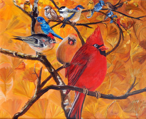
There was something about it that bothered me. Mostly, the huge, front-and-center, corpulent, overly bright cardinal. And the overly bright background.
“Angry Birds in the Garden” started out as a nature study. It turned into a Disney cartoon on LSD. The imagery was supposed to curl and curve gently. Smaller images of birds would emerge from the background, guiding the viewer’s gaze to tree branches and bright gingko leaves that presented a finale: a commanding, eye-grabbing cardinal. Or, as was more obvious, the cardinal in the front, his mate to the left, and a variety of species behind and beyond in a sickening vortex.
It didn’t work. Too silly. Too big. Too fat. Too bright. Too amateurish. I changed the cardinal to an owl. That was even worse. I moved it closer to the edge. That ruined the circular pattern of branches. I set it aside.
For three years.
And then it came to me—one of my favorite birds was a bluebird on the upper-left center. Repaint that bird, forget any larger birds, and introduce a beautiful fairy woman. A birdlike woman. No, not bird legs like a New York model. Something delicate and bird-like. Her hand would reach toward the bird, gently welcoming him into her world, just as he welcomed her into his.
I used my own hand, minus a few wrinkles. The face, um, no. She was a total figment of my imagination. I painted over the course of four days until she emerged, fully formed.
I toned down the colors. No more glaring crimson and gold and yellow oxide. Replaced the whirling vortex with an art nouveau frame, woven with vines and tresses. Now, the focus made sense.
Someday, I may attempt another bird painting that curves and draws your eye deep into the interior. It will be more mysterious, calmer, less in-your-face. It will have fewer species crying out for attention.
In the meantime, I am just relieved that I revived an old painting that hurt to look at. It ruffled my feathers. It was driving me cuckoo. Cawing at midnight. Chirping off-key. I had committed all of the cardinal sins of art in one piece.
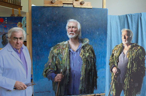
My assignment: Create an oil painting of the Port of Pusan, Korea, 1950-1953, for the Army Transportation Corps. Final product to be displayed in the Fort Eustis Army transportation museum. Commemorative posters to be sold at a cocktail party and unveiling.
My resources: Transportation library, transportation museum, Internet, public library, stationary ship rigging on base, interviews. An entire war history at my fingertips—a military goldmine! Not.
Photocopies are various undecipherable shades of gray, scenes distant, nondescript. Figures and vehicles miniscule. I scour the library, rows of history on WWI, WWII and Vietnam. This is why the Korean War earned the nickname “The Forgotten War”: a mere seven books line the shelf. Only one contains photos.
The Army wants to help. But these men—too young to have served in Korea—need direction. They call the venerable General Fuson. He was there – in Korea. He is a god. The men sigh, gesture erratically, pace like chipmunks on methamphetamines. They speak of no one else. They frown at my sketches, mutter vague comments. Their attitude disturbs me—these privates, colonels, majors. “General Fuson this, General Fuson that.”
I don’t know much about the military. I read military time only slightly faster than Roman numerals, which means that by the time I’ve figured it out, my lunch date has come and gone without me. I don’t even have ranks memorized. All I’m interested in is whether I’ve used the correct color green in the right hand corner, the perspective is right, the paint is dry on time and the canvas is of archival quality.
I feel my eyebrows rise when I locate the general’s image in reference books. Awed, pleased, I flip pages and notice the parallel progression of age and rank as the page numbers advance. I should be nervous. How am I to illustrate in a single painting the fact that by the end of 1952, 10 million tons of cargo had moved through the Port of Pusan? My solution is representational: a portion of cargo, a small segment of the transportation corps. The men want to show it all. I cringe.
We will meet the general in one month.
Sketches. Meetings. Gestures. Pacing. Angst. Two weeks.
Phone calls. Last minute changes. One week.
From a towering height, the mighty general will overshadow me, block the door with his square shoulders, glare down his nose and dismiss me in a gravelly George C. Scott/General Patton voice. His presence will reduce me to a jellied 16th century artisan peasant. Who am I, a coddled, indulged artist, to recreate his war experience? The entire transportation corps’ Korean War experience?
Will the general insist on changing every pencil line? Will the accuracy of his recall interfere with my design sense? What if he vetoes the whole thing?
Today: I will meet General Fuson. I have planned my schedule to the nanosecond. I will arrive 15 minutes early, relax, review my sketches.
But weeks of agitating comments have chipped away my composure. I awaken with a headache and sense of spaciness, as though I have overdosed on antihistamines—or perhaps just hyperventilated. I drop pens, keys, my notebook. I walk into a chair, bruise my hip. I use my good hip to hold open the screen door. I swivel awkwardly, keys in one hand, portfolio gripped in the other, and attempt to pull the door shut. The dog shoots out beneath me, homing in on a squirrel. I chase the dog, scrape my leg on a rose bush. My high heels sink into the mud. I limp back to the house, lock up the dog, wipe off the blood, and take a swipe at my shoes with a paper towel. Now, I will be late. The general will banish my painting to a novelty wholesaler and my artwork will end up at a starving artist sale at Motel 6. My career is pureed.
I try calming myself with soothing nature music in my car. But a thunderstorm and irritating little crickets mating to a synthesized flute exacerbates my mood. My mind darts ahead. Should I salute? No, I am a civilian. Besides, the general is retired. I will shake hands, as any normal businessperson.
I arrive on base. “Wait outside the meeting room,” I am told. I pace. What if I misread the photos? Turned a wheel cover into a luggage rack? A pile of netting into a storage box? An Army insignia into an insect? Of course, that is why I am here. This is no different than working with an art director at an agency. Corrections are the only way to ensure the proper outcome. Besides, these aren’t corrections. They’re instructions. Constructions.
The door opens. Two uniformed men and a woman, alongside whom I have worked for several weeks, escort me. My heel catches on the carpet. My portfolio flares sideways, blocking the door. Like a canoe paddle, I turn it sideways, slice through the space. Four men await us. They are chatting, their backs turned. I open my portfolio, spread my drafts on the highly glossed table. Behind my shoulders, I hear, “Sir, this is our artist.” The moment has arrived. I straighten, pivot, and extend my hand in greeting.
Revelation, epiphany, shock—no word can accurately describe the image before me. Now I know what people mean when they say that time stands still. It not only stands still, it turns in on itself, launches shards of light, ignites my sleepy synapses. Here before me looms no five-star general, no growling Patton, no hulking, crew-cut mammoth studded with rows of medals, stripes and bars.
Before me smiles a charming, diminutive, silver-haired gentleman with an unmistakable air of humility. We are nearly equal in height. His silken hair is perfectly combed. His eyes twinkle. His palm is smooth and firm in our handshake. He wears hearing aids.
I long to sit with a cup of tea, take him aside for a chat in a wingback chair. But the men have made me wary. The critique begins.
“Sir,” commences one of the soldiers, “is it correct to bring in the ship from this side? And have we placed these hills properly in the background? And what about lining up the trucks like this? The tracks down the center, Sir?”
The general pauses. Slowly, with much care, he replies, “We had a huge storage area, a building that took up almost the entire pier. I don’t know how it looks now. Why don’t you ask someone who has been there recently?”
The soldier clears his throat. “Sir, we need to know what it looked like then. When you were there. Is this the way you remember it, Sir? Should these cranes be here? What about the tracks? We have crane tracks near the railroad tracks. Are they too close?”
The general examines the drafts carefully. His brow is very slightly furrowed. He nods almost imperceptibly. I await a response. The soldiers wait. Finally, the generally replies, “The warehouse took up most of the space.”
My heart sinks. I can’t block out the entire scene with an ugly rectangular warehouse. It has no windows, no reflections, no shadows, no defining characteristics.
The questions spring forth more rapidly now. “Did you have boxes or bags, like we have here?” a lieutenant asks. Another man points to a pencil sketch and inquires, “The ships here—did you use any Liberty ships, Sir? Were these Army or did you use others?”
“What about the angle of the ship as it’s pulled in near the warehouse?” a lieutenant asks. “Is it facing the right direction? The open hold—would it be filled? We’d like a barge over here, in the background. We’re thinking of adding more cargo. And there will be more people working. We put a guard on deck. I hope you like that.” Finally, he asks, “Does this look like it was?”
The general stares intently at the largest, most detailed drawing. There is a suspended silence. Then, quietly, he murmurs, “I don’t remember.”
My jaw slackens. My gut unravels. My headache releases its Vulcan death grip on my neck. My feet are safely planted on terra firma. He is human, this demi-god.
I study the faces around me. I watch them watch the general. They, too, are relieved, but more, they are bewildered. How will they proceed? They are a universe apart from me. They have had years of training and indoctrination. They operate within the peculiar confines of the military structure, just as executives work through the corporate management hierarchy. This moment to them represents a culmination of years, events and experiences telescoped into one definitive meeting. The general will approve their battle plan. He is expected to validate their efforts on this day.
I have no comparable reality. And so my monolithic, military gargoyle sifts to the floor like ground pencil shavings. I had planned to re-draw my sketches. Now I will rework my concepts.
It is not the general who determines the final direction of my work. Nor am I the maestro of the canvas. Form, line, positioning, subject are decided by the men who hired me to begin with. They design the final piece imagining how he would want it.
The painting accurately depicts the Port of Pusan during the Korean War. It is unmistakably military—olive green, muted gold, tan, brown, gray. It is unarresting, self-conscious. I want to add more figures. I want crowding, lifting, sweating, jostling, walking, blurring in united effort. I want to feel the action. I want to be there. I want to bring out the reflections in the headlights of the trucks. I want to zoom in to individual faces to catch glints of light in their pupils, crows feet at the corners of their eyes. But I have run out of time.
Every man who worked at this port must see himself in some work he performed. I must include cargo, tons of it. Things, things, 10 million tons of things. I am not creating a work of art. I am creating a memory, a piece of history. I placate myself with that thought.
The night of the unveiling I shake hands with a roomful of military men and their wives. Many served in Korea. They smile and thank me. We are all very polite. But I wonder, did I do well? Do they see themselves? Is it real? Will these prints hold a place of honor in their homes, or will they be shoved in the attic along with other memorabilia? I have no way of knowing. I did not lift those crates, drive those trucks, fire those weapons. I am an artist with a paintbrush.
How does an artist know when a painting is finished? I knew when I realized that none of this had anything to do with a general—an unassuming, humble and forgetful man who plays golf and laughs with his friends at lunch. His real power lay somewhere in the past, in an Asian port I will never see except in a painting mastered by my own hand.
Note: Lt. Gen. Fuson died February 15, 2004 in Williamsburg, Virginia
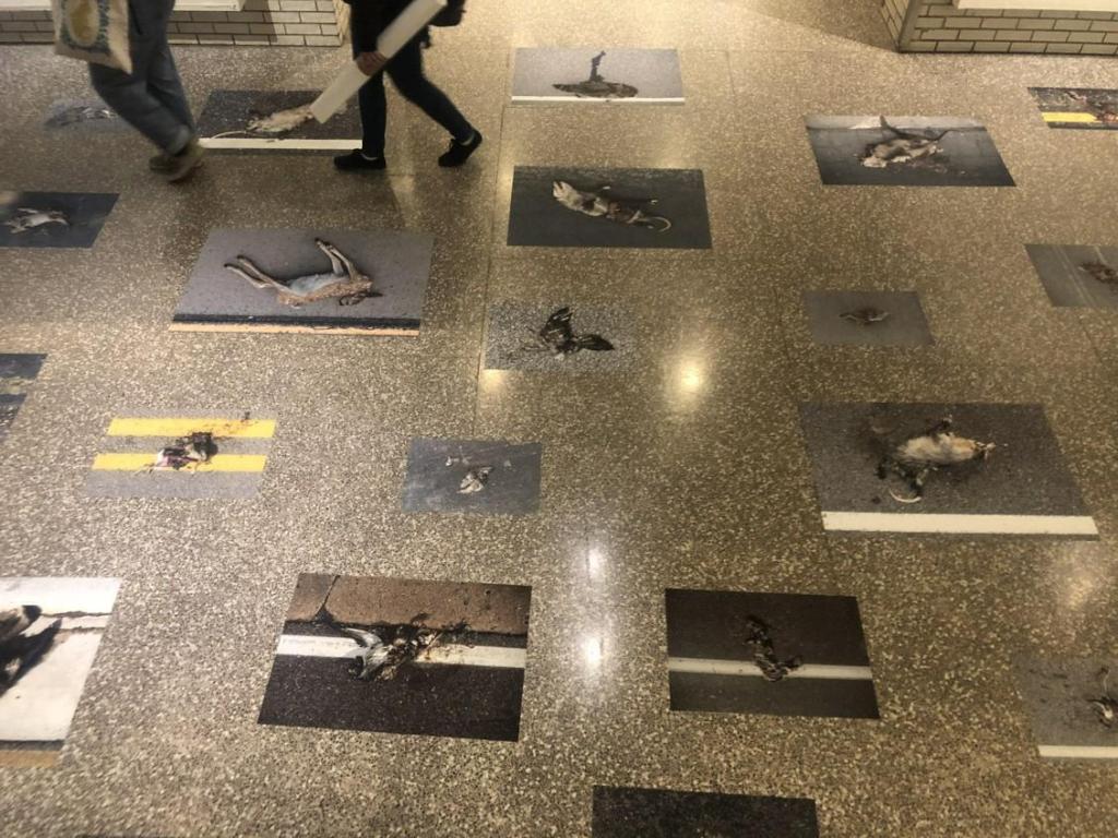
Roadkill photographed and adhered to a lobby floor is not art.
To explain: Minneapolis College of Art and Design senior Hannah Andersen in 2019 won a Merit Scholarship from West Photo for $4,000. A merit scholarship is described as work based on students’ displays of their work. Each year, a jury of MCAD faculty members awards Merit Scholarships to participating students in a variety of categories.*
I hate to criticize “one of my own,” as it were. Especially from my alma mater. But then, maybe that’s why it pains me so much. I expect more art, more intellect, less shock value. MCAD’s mission statement is, “Where Creativity Meets Purpose.” Really? What is the purpose of this display?
Call me cynical, but by the time I was a senior, 75 percent of my class had dropped out. Of those who graduated, half got and kept jobs in the fields of art, design, photography, or theater. To its credit, MCAD’s 21st century course selections include a slew of computer courses as well as a major in Entrepreneurial Studies. If Ms. Andersen’s future lies in editorial photography, she may do well. But as art qua art, her senior project is a bust. Aesthetics, 0. Shock value, 10. The faculty who nominated her has questionable values and even more questionable eyesight in regard to art. Design, meh. A loose grid pattern is inarguably a design.
The room-sized, life-sized exhibit packed a punch. As in, the gut. Feathers crushed and smeared on asphalt; bloodied entrails of a rabbit; comatose squirrel; smashed snake. You get the idea.
Without having to define art, and even without a common aesthetic, this display is clearly not art. Does it involve hard work? Yes. Photography skills? Yes. Initiative? Certainly. Creativity? More-or-less. I have heard more than one person suggest, over the years, “Wouldn’t it be funny if someone photographed road kill and called it ‘art’?” That a senior at MCAD actually executed the idea does not lend it any creativity.
In 2008, Marc Seguin featured a show entitled, “Roadkill” at New Charest Weinberg Gallery, Miami. His oversized pieces consisted of taxidermied animals such as a wolf and quail interacting with humans. One painting displays a moon-type sphere in transparent white on a background of warm beige. From it hangs an upside-down quail. Blood from an outstretched wing drips down the otherwise blank canvas. Another piece features a man free-falling, face-down, inches above a double-image coyote, muzzle open, preparing for contact. Clearly, these are conversation pieces, editorial pieces, artworks. This is interpretive art. https://www.designboom.com/art/marc-seguin-at-new-charest-weinberg-gallery-miami/
Not all art is beautiful. Picasso, Goya and many others have established that. But something as common, albeit sad, as roadkill, in and of itself, doesn’t have enough editorial content on the face of it to even place it in context. I have thought and pondered and what-iffed Andersen’s MCAD Roadkill series. Roads and roadkill exist outside; the display existed inside. So the display was taking an uncomfortable fact of life and making it more uncomfortable. To what end? Roads and roadkill are man-made. So? Squirrels, birds, snakes and possum are trampled by horses and killed by hail, too. What makes this so special? So creative? Why not paint them instead of photograph them? Why simply place them on the floor for people to walk on or around?
I give up. I’m too blinded by the shock value of exploding guts to appreciate this intersection of nature, humans, and photography. It all makes me feel as though art and culture are on a collision course. In the meantime, I’ll take my car through the carwash, just in case any remnants of contemporary art are stuck to the front grille.
*Just in case someone should conjecture that I am sour grapes about not receiving a Merit Scholarship, I did receive a tuition scholarship during my second semester at MCAD. It was based on grades and performance. I hold no grudge against Ms. Andersen. I just don’t understand or appreciate this kind of art and design.
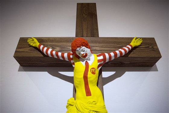
I don’t consider myself a religious snob. I don’t even go to church. So when I first saw the Finnish artist Jani Leinonen’s “McJesus” sculpture on Facebook, I surprised even myself with my reaction. I thought it was offensive and stupid. My first thought was, “Why? What’s the message?” It was clearly a slam against the corporate world, with McDonald’s as the poster child, but was it about corporate capitalism being sacrificed or was about capitalism replacing Christianity?
The sculpture is part of an exhibit in a Haifa, Israel art gallery called “Sacred Goods.” The traveling exhibit had not caused problems in other countries, nor had it caused problems in Israel up until now. But apparently, it was shared with the wrong people—aka devout Arab Christians—on social media and riots ensued. Someone threw a firebomb. Police responded with tear gas and stun grenades. The next day, hundreds protested.
Leinonen was shocked at the response, saying that he himself was a Christian. Museum director Nissim Tal said that he was shocked at the sudden uproar.
Considering that the exhibit also includes Barbie doll renditions of a bloodied Jesus and the Virgin Mary, “McJesus” is in good company. Dressed in his representative, bright yellow outfit, sporting bright orange hair, he hangs on a simple wooden cross, head bowed. The artist included nice touches like tying Ronald’s tunic in a knot to mimic Jesus’ woven girdle. To say that it is a confusing message is an understatement. This is one case where shock value obliterates the message.
Leinonen states that the sculpture was “intended to criticize what many view as society’s cult-like worship of capitalism.” Ah, yes, capitalism, that cause of all things evil yet desirable, the concept that makes people work hard for a living.
“This is very offensive and I cannot consider this art,” Haifa artist and devout Christian Amir Ballan said. I have to agree, in part, with Ballan. It is offensive, and it’s not the best art you’ll ever see. Nothing on the scale of say, Bernini. (Never mind that he created pro-Christian sculptures of adoration.) However, I disagree that that the art should be removed, as he and hundreds of rioting Christians have demanded.
Also calling for removal are church representatives and even Israel’s culture minister, Miri Regev, who threatened to withhold state funds to the museum if it continues to display the work. “Disrespect of religious symbols sacred to many worshippers in the world as an act of artistic protest is illegitimate and cannot serve as art at a cultural institution supported by state funds,” she told the museum. Ah, now we’re approaching an American reaction. (NEA funds, anyone?) Church representatives were only slightly more judicious, bringing their grievances to the district court Monday (January 15), demanding it order the removal of the exhibit’s most offensive items, including the aforementioned Barbie dolls.
Now that my eyebrows are back in place (they leapt off my forehead when I first saw the image), I have to say that this sculpture certainly pales in comparison to the infamous Andres Serrano piece from 1987, “Piss Christ,” a creation so outrageous, it defies definition. Plus, no one got the point. In case you missed it, or you were born after the millennium, it is a photograph of a crucifix immersed in a glass of urine. Serrano received a grant of $20,000 from the National Endowment for the Arts for this piece, and presumably, others.
Which brings me back to Regev, who called to withhold state funds from the museum. Too late. The exhibit was already assembled and displayed. She will merely recreate the steps that we Americans took in the ‘80s and ‘90s, where museums yanked controversial shows, but like the Hirschhorn, in doing so created more controversy. Legislators drafted laws disallowing pornographic imagery (such as Mapplethorpe’s black-and-white homo-erotic, exploitative photographs). Within six months, they had to re-word the legislation because the laws created even more flavors of controversy by threatening to withhold funding if exhibits were not properly vetted.
In the meantime, museum director Tal has placed a curtain in the doorway of the “Sacred Goods” show, along with a trigger warning. To his credit, he refuses to remove the artwork, saying that doing so would infringe on freedom of expression.
“We need to understand that freedom of expression is interpreted in different ways in different societies,” said Wadie Abu Nassar, an adviser to church leaders. “If this work was directed against non-Christians, the world would be turned upside down.”
Put another way, if this were a sculpture of Mohammed eating a McMuffin, Leinonin would be dead right now.
Speaking of whom, Leinonin has backpedaled like a high-speed cartoon character. He told TheJerusalem Post that he thought his piece had already been eliminated from the “Sacred Goods” exhibit because he had asked for its removal. But not because it was offensive to minority Christian Arabs. Having recently joined the Boycott, Divestment and Sanctions movement against Israel, he stated that “Israel overtly uses culture as a form of propaganda to whitewash or justify its regime of occupation, settler-colonialism and apartheid over the Palestinian people.”
You would think he’d have read the itinerary for the show before he submitted to it. I would suggest we divest of any future artwork he brings our way. Leinonin is a few fries short of a Happy Meal.
When I moved into our new house, I went on a decorating binge. Merchant’s Square in Williamsburg beckoned—not that I was in love with Colonial style, but there was a privately owned, interior design shop that I adored almost as much as chocolate. The name was G. Bates. Sadly, Gail passed away and her shop closed. But for many years, I stopped by there to pick up various pillows, jewelry, or just wander the halls for inspiration.
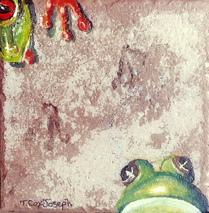
My first inspiration came by way of three printed plaques that I purchased. Designed to mimic stone, cracks and all, the rectangular designs had two layers and were imprinted with a variety of herbs, vegetables and flowers. I hung them on the dining room wall and stood back to admire them.
And then it hit: I can do that! But mine would be originals. I zoomed over to Home Depot and picked out a variety of 6” X 6” rough-hewn bathroom and kitchen tiles. Some were made in Italy, some in America. The designs poured or imprinted on each tile were subtle, imitating everything from granite to limestone. Because of the embedded designs, I was gifted with a half-completed palette. Above this crack, I would paint a trompe l’oeil, costate hornshell. There, at the bottom, I would paint a coquina. And this, with the reddish background and black streaks, would become a tiny Lascaux cave painting.
This was the perfect project for me—a mom with two very active kids. I could paint at the kitchen table while they did their homework. I could spray-varnish them outside, in between pre-heating the oven and marinating chicken. They were small enough to stack on a bookshelf and didn’t take up a lot of space like large canvasses.
I painted pinecones, lilies and ferns from my yard, frogs, prehistoric fish, and miniature busts or figures of Buddha and Cambodian goddesses.
Already an artist member of a co-op gallery where I sold watercolors, acrylics and oils, I remember being juried into the gallery again—for my tiles. Intellectually, I knew they’d be accepted. They’re completely different from my traditional 2D work, and it makes sense to jury them separately. Still, the butterflies in my stomach threatened to collide with the butterflies on my tiles. Artists are like that.
I continue to paint and sell tiles. They are my bread and butter, so to speak, at local galleries. They’re decorative yet useful—and usefulness is a tipping point when selling otherwise indulgent art. Most of the time, the tiles are hung on the wall. “Oh, I would never put something on top of this,” people have said, when I tell them the tiles may be used as trivets. I am grateful for that. Many clients have returned to buy tiles throughout the years, creating a collection.
Some of the small tiles only take me an hour. Others, for example, a 12” X 12” sea turtle, take several hours. After I finish painting each one (usually with Liquitex heavy body acrylic), I spray it with six, thin coats of varnish. On the back, I attach corner bumpers and glue saw tooth hooks, so that clients have a choice to hang them or set them on the countertop.
I tested my first tiles with varying degrees of varnish, anywhere from two to ten coats, let them sit for 24 hours, and then placed a boiling hot teakettle on each one. Even the thinnest coats of Krylon held up. But just to make sure, six became my magic number.
I inadvertently water-tested them outside in the rain. As fate would have it, I forgot about them when a tropical storm soaked us for three days. When I re-discovered the tiles outside the back door, I carelessly picked them up, intending to toss them into the trash. But the images—a Chesapeake blue crab and a pink, spring tulip—glistened with perfection. And so I was able to inform clients that these could be used as kitchen backsplashes, another useful approach.
Just when I think I’m tired of painting trompe l’oeil images on tiles, I stumble upon a different pattern and my muse is reborn. I’ve painted on pre-fired terra cotta, slate, slick bathtub tiles, and imitation granite. I never know when a slight imperfection or color alteration will spark my imagination.
At one point, I hired a contractor to drill holes through several 12” square tiles so that I could make the painted images into clocks. Yet another useful indulgence. Seashells and turtles, as well as leaves work well on the clocks. Faces, either human or animal, require a lot of fidgeting and positioning before I actually paint. After all, no one wants a turtle or a Greek goddess with a moustache at 3:40, do they?
Oddly, I have no tiles hung on my own walls. I still have the original botanical prints on faux stone from G. Bates. A bit like the shoemaker whose kids went without shoes, I suppose. We’ve lived here in our “new” house for 20 years now. Time to start redecorating!
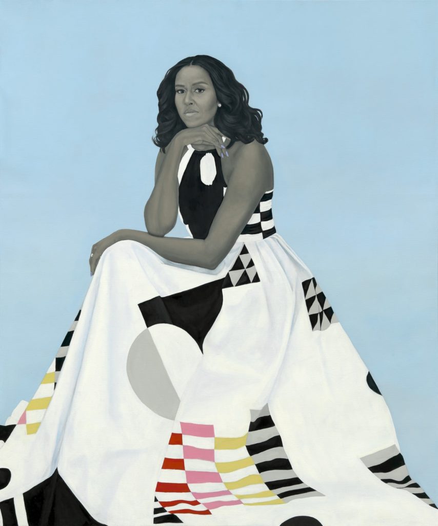
And now for Michelle’s portrait. A disappointment. A designer piece, like the dress it depicts, from Michelle Smith’s fashion line, Milly. The dress is striking, a contemporary statement piece with its bold, graphic design. And that’s how I see Michelle. But I do not see her likeness. I see the shape of her face. The beginnings of a portrait. If I were First Lady, regardless of ego, I would expect my portrait to look like me, not just to represent me. But I’m not Michelle Obama.
Some reviewers claim that she and Amy Sherald chose the dress together. Others surmise that Michelle Obama picked it out and it was sent to Sherald as reference material. Interestingly, while most of Smith’s sketches are signed with the date and her initials, or a comment like, “Fall Line,” this dress is signed “XO.” Hugs and kisses?
Sherald commented, “It has an abstract pattern that reminded me of the Dutch artist Piet Mondrian’s geometric paintings. But Milly’s design also resembles the inspired quilt masterpieces made by the women of Gee’s Bend, a small remote black community in Alabama where they compose quilts in geometries that transform clothes and fabric remnants into masterpieces.” (Hannah Morrill, Elle, February 13, 2018.)
Interestingly, Smith herself says it was meant to be “a dress that Mrs. Obama could wear in her everyday life, as well as in this iconic portrait.” The designer adds, “It’s made of a stretch cotton poplin print in a clean, minimal, geometric print without a reference to anything past or nostalgic, which gives the dress a very forward-thinking sensibility—this is very Michelle Obama.” (Brooke Bobb, Vogue, February 12, 2018.) (Italics are mine.)
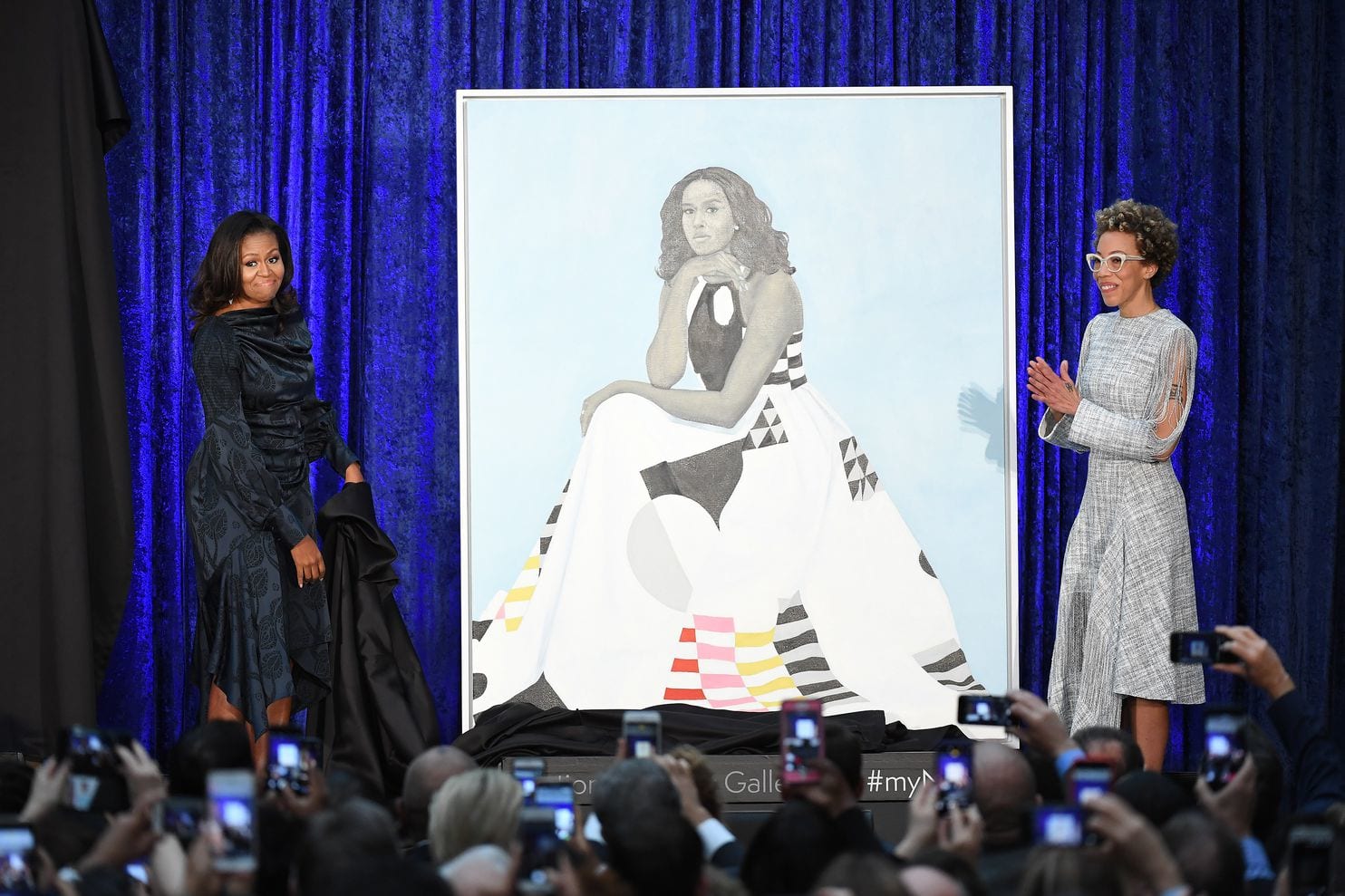
Michelle loved that the painting is iconographic. “As a young girl, even in my wildest dreams, I never could have imagined this moment,” she wrote on Instagram. “Nobody in my family has ever had a portrait — there are no portraits of the Robinsons or the Shields from the South Side of Chicago. This is all a little bit overwhelming, especially when I think about … so many young girls and young girls of color who don’t often see their images displayed in beautiful and iconic ways. I am so proud to help make that kind of history. ” (Brittany Packnett, The Cut, February 2018.)
Some History
Yes, she has made history. But I wish that someone had told Michelle that a good portrait should do both—look like the sitter and represent the sitter. As in Diego Rivera’s work, which struggled beneath the artist’s difficulty with foreshortening and likeness, it is the message that counts. Any problems with visual perspective or proportion became so embedded into his oeuvre as to be trade symbols. “Oh, that’s a Diego Rivera mural,” or “Look at that Amy Sherald painting.” They conjure imagery, concepts and politics—but not necessarily mastery of the human figure or portraiture.
Sherald’s signature gray fleshtone is a mixture of black and Naples yellow, which she says was suggested by a colleague to remove the silvery, flat tone of black-and-white. (A great hue idea I may borrow.) She dresses her figures in a variety of bright clothing, using a background of muted and blended or solid color. Amy Wong writes for Medium, “This is Sherald’s signature style. Her paintings of African Americans are anonymous. They resemble their subjects, but at the same time, they do not.” Sherald is quoted by Dorothy Moss of the National Portrait Gallery as saying, “Once my paintings are complete the model no longer lives in that painting as themselves. They have become something bigger, more symbolic. . .” Which is exactly why it is not a portrait.
Nor, to her credit, does she call herself a portrait artist.
Portrait artists have historically fudged their data, but not for her reasons. They had to or, as in the case of the last portrait of King Henry VIII, they would have been beheaded. (King Henry wanted to look younger and thinner. He sent the artist back to the drawing board several times. One can image what the king really looked like if his last portrait was flattering!) The portraitist’s job was to show royalty and the wealthy at their finest. It was designed to inspire awe and create a representation of power or valor. Still, anyone looking at the portrait should recognize the individual. Will people recognize Michelle in her portrait in 50 years? Will the American public be better educated on contemporary art in 50 years?
“Michelle is painted as if in a black and white photo,” Wong says. “Sherald has said that she does this to remove color as race.” What Sherald actually said was that she uses gray tones “to exclude the idea of color as race from my paintings by removing ‘color’ but still portraying racialized bodies as objects to be viewed through portraiture. These paintings originated as a creation of a fairytale, illustrating an alternate existence in response to a dominant narrative of black history.” (Joan Cox and Cara Ober, BMoreArt, November 29, 2017.)
Wong goes on to say, “Historically, black people have not had paintings to represent them. Only photos exist.” Wong is totally wrong. She took Sherald’s quote out of context. Wong apparently believes that only American images of black Africans exist in black-and-white photographs after the invention of the camera. While Sherald did say that she uses old black-and-white photos for inspiration, Wong missed Sherald’s operative word: “Narrative.” Wong should also have inserted, “American.”
One only has to look at one of hundreds of portraits of the biblical three kings after Jesus’ birth to find black Africans painted as they looked (i.e. not caricatures, as Wong insists). Black royalty in Europe, Egypt and central Africa has been represented in bas relief and with coins since the second century A.D. and in portraits since medieval times. For fun, check out this link, to read about a woman who researches black Tudors: https://www.historyextra.com/period/tudor/black-tudors-60-seconds-with-miranda-kaufmann/
Wong goes further afield to say, “As for Michelle Obama’s portrait, there has not yet been a gallery in the Smithsonian that is devoted to showing the portraits of first ladies. After a temporary installation, Michelle’s portrait will most likely end up in storage. In this case, art follows life.” This is pure fiction. Anyone (except Wong) would have surmised that such an iconic portrait would be purchased and donated. It has been shown at the National Museum of Women in the Arts in Washington, D.C., where Sherald gave a talk, and now hangs in the Smithsonian.
To quote the Smithsonian website, “On February 13, 2018, the commissioned portraits of the 44th President, Barack Obama, and First Lady Michelle Obama were installed in America’s Presidents and Recent Acquisitions, respectively. Mrs. Obama’s portrait has been relocated and can now be seen in the 20th Century Americans exhibition on the third floor.”
Ironic Icon
Sherald’s quote now becomes ironic. “… the model no longer lives in that painting as themselves. They have become something bigger, more symbolic. . .” Of course, Michelle Obama has now become a symbol of achievement for black, American women. But one has only to look at Sherald’s body of work to see that all of her paintings are those of individuals: One wears glasses. One is thin. One has fuller lips. One has a narrower jaw. One’s eyes are closer together. Each one is unique, as is Michelle; Sherald even gave her the blue fingernail polish she wore at the 2012 Democratic National Convention.
We are, each of us, different. We are individuals. Sherald is painting individuals who represent the black community. But even as a whole, the community is not a collective. Because we have grouped human races into categories should not mean that we are interchangeable replicas.
A bit about Amy Sherald
Sherald was raised conservatively and broke out of her fundamentalist religious upbringing, which led her to question her role in society as a black female. It was clear that white supremacy had laid the cultural groundwork, that social movements had changed it, but she felt she was past that, and did not want to be confined by contemporary, angry black narrative, either. Her figures exude a sense of self-assurance, as compared to Wiley’s figures, who exhibit everything from anger to bravado to intimidation. (With the exception of Obama, who exhibits a calm intensity. A subtitle could be stolen from August Rodin— “The Thinker.”)
Award-winning Sherald’s curriculum vitae is stellar. She has received residencies in Panama, Norway and Beijing, China. In 2012, Sherald, who suffered from cardiomyopathy, underwent a heart transplant. She signed a release form accepting the potential of danger from a high-risk patient. Later, she found out that her new heart belonged to a woman who had overdosed on opioids.
In response to the question of whether the fame surrounding Michelle Obama’s portrait affected her life, Sherald said, “It did boost my confidence, only because I had been struggling for the longest time. You know you’re going to make it—everything was starting to fall into place—but it does kind of wear down on you when you’re in your 40s and you need to borrow money from somebody. You get these feelings of shame.” (Sarah Cascone, June 20, 2018, Artnet News.)
And That’s What it’s all About
The Obamas’ portraits create a conflicting narrative. Where past presidents commissioned portraits by bona fide portrait artists, the Obamas chose museum-geared, contemporary artists. Where past presidents preferred exact likenesses in settings with familiar accoutrements, the Obamas sought broader statements.
Now that time has eased the eyebrow-raising aspect of the portraits, I am amused and pleased by the Obama’s choices of contemporary artists. But I am also saddened.
Because of the Obamas’ life experiences and race/color, as well as their philosophy, they chose to be “everyman” and “everywoman” in their portraits, particularly to the black community, and thus sublimated the fact that like the artists they chose, they had to work to achieve. In attempting to be a part of the multitude, they lost sight of their individualism (Michelle, in particular, because of the lack of resemblance). The president and first lady are figureheads, but they are also exceptional individuals.
Michelle Obama’s portrait has not been disassembled as much as, say, a Picasso. Mostly, it has been de-personified. I see only a pretty lady in a knock-out dress.
“They’re portraits whose subjects care about aesthetics, who are thoughtful about the history of portraiture, and who have the personal charisma to carry the weight of that history on themselves. … Which is important, because history is going to weigh heavily on the portraits of the first black president and first lady, painted by the first black artists commissioned to makethe official presidential portraits.” (Constance Grady, Vox February 12, 2018.)
Wait! What about Simmie Knox? Ahh—because he is a professional portrait artist, he has no “narrative.” His blackness has already been forgotten. Talk about de-personifying.
By choosing Kehinde Wiley, who has embraced in-your-face imagery and utilized stinging satire, former President Barack Obama angered a vast swath of his country. As much as Barack Obama attempted to heal, he hurt.
Ironically, the idiom, “A picture paints a thousand words” couldn’t be more apt for two portraits that left many Americans speechless.
We all view life through our own filters. But when one is president, he needs to provide direction and connectivity. For many, the Obamas choices of portrait artists caused confusion and disconnection.
Abraham Lincoln’s famous quote (written originally by Poet John Lydgate) couldn’t be more apt here. “You can please some of the people all of the time, you can please all of the people some of the time, but you can’t please all the people all of the time.”
I would guess that future presidents will choose traditional portraits. In the meantime, these pieces remain peculiar, 21st century archetypes.
Now that the furor is over and the portraits are hung, I’ll weigh in on the “scandalous” presidential portraits at the Smithsonian’s National Gallery.
Numerous people were astonished by the images and artists chosen by former President Barack Obama and his wife, former first lady Michelle Obama. Why? Firstly, because they are contemporary art, by artists Kehinde Wiley and Amy Sherald. Neither portrait is a simple oil rendering of the face of a leader. Secondly, because they are difficult to understand. For the same reason. This is the first time any sitting president has chosen a contemporary artist over a traditional portrait artist for his portrait in the National Gallery. It is the first time any sitting president or first lady has chosen artists who interpret the subject in a wholly different way. Imagine Surrealists Marcell Duchamp or Helen Lundeberg doing Truman’s presidential portrait. Thirdly, because they are political. Aren’t all presidential portraits? Not as much as these.
Wiley’s and Sherald’s points-of-view are not so much portraiture as figurative intellectualism and archetypes. That works in museums, but not so much in presidential portraiture. It simply comes off as peculiar. (Critic Ben Davis uses words like “weird” and “fanciful” in his ArtNet review.)
Another way to Choose an Artist
Both Obamas chose black American artists. That makes sense: why not seize that opportunity? But judging from the scarcity of black artists on Google and in The Portrait Society of America, choosing a black portrait artist of renown is no easy feat. (The Smithsonian submitted a list of choices to the Obamas.) The Smithsonian has a wonderful collection of African American art created by over 200 African American artists (https://americanart.si.edu/art/highlights/african-american), but these are primarily social commentaries, not portraits. It’s a subcategory within a subcategory within a subcategory.
Did the Obamas have to choose a portrait artist? No. They stepped out of everyone’s comfort zone, deliberately. Some artists simply prefer the term, “artist.” Others incorporate their heritage, cultural identity, race and politics into their work. The latter was the Obamas’ priority.
Where do I Stand?
No surprise that as an artist trained in illustration, I am going to put the art first. And the first artists who come to mind are John Singer Sargent,
American icon Maxfield Parrish,
Kimmie Knox, (more on him in a minute), or
Gerald Ford’s and Ronald Reagan’s portrait artist, Everett Kinstler,
who was a pulp and comic book illustrator.
Were I the president and had an opportunity to choose a black American portrait artist, I would have chosen from talented, non-controversial names. Alas, most of those artists have died.
For example, children’s book illustrator John Steptoe, with his geometric slash-patterns or more realistic renderings would have been a wonderful choice. But he died young, in 1989.
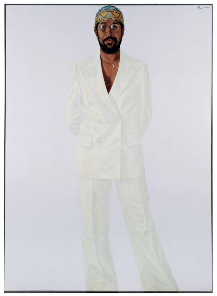
While Barkley Henricks was not my first choice, many works I like and have pizazz. He was a figurative realist with an existentialist flair. (I would have had to convince him to visually flatter me.)
Some of his pieces were strikingly similar to Wiley’s work, including detailed backgrounds and shocking switcheroos. But he died last year.
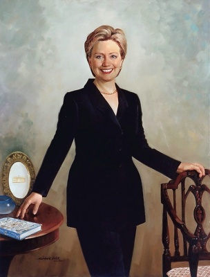
I’m betting that Simmie Knox’s portraiture is too traditional for the Obamas. From the moment they moved into the White House, they requested contemporary and pop art on their walls. Hillary and Bill Clinton hired Knox for their White House portrait (Nelson Shanks painted the National Gallery portrait). It was a perfect way to expand the stable of American presidential portrait artists while expanding social consciousness. Both Obama and Clinton made political statements by choosing the particular artists they chose. You can “see” their politics.
I love the visible brushstrokes in Knox’s work, yet the paintings remain detailed and realistic—the perfect marriage. His portraits make statements about the subjects using color, expression, likeness and surroundings without overkill.
Simmie Knox is humble, traditional (three years in the army), and outrageously talented. “I realize there has never been an African American to paint a portrait of a president and, being the first, that’s quite an honor and quite a challenge,” he told ABC News about painting Bill Clinton’s portrait.
President Barack Obama’s Portrait
Barack Obama’s portrait (scroll up) depicts him seated on a chair against a backdrop primarily of green foliage—leaflets of fives and threes, some smooth and some ribbed, along with a minimal amount of flowers. As described in an article in Popular Science Magazine by Eleanor Cummins, the jasmine represents “Obama’s birthplace and childhood in Hawaii. The pink and gold flowers are chrysanthemums, the official flower of Chicago, where Obama became a community organizer and, ultimately, a senator of Illinois. And the purple flowers are African blue lilies, a reminder of his father, Barack Obama, Sr., a Kenyan man.”
Barack Obama’s portrait looks like him. His nose, his eyes, his lips and ears, the shape of his head. He holds a deceivingly commanding pose, seated and slightly relaxed, legs apart, with his arms crossed on top of his legs, as though he is set to give you a stern lecture. The skin tones are vibrant and blended, if a bit exaggerated (as an acrylic painter, I lean toward Disney-style tones, as well). His people look real.
Secondly, his traditional pose imposed on an imaginary background does not sacrifice the entirety of the portrait. Wiley is a passed master at blending realism with other-than settings. In fact, he got his start painting black, Harlem youth in regal postures wearing the attire of European royalty.
More about Kehinde Wiley and his Work
I love research almost as much as chocolate. So of course I researched while I was writing this article. In some ways, I wish I hadn’t. In my fairytale art world, I imagined Wiley painting every last brushstroke himself. Alas, he hires assistants in China. He also has a studio there. It’s a cost-cutting measure. (http://nymag.com/arts/art/rules/kehinde-wiley-2012-4/)
I have seen Wiley’s work close-up at the Chrysler Museum in Norfolk, Virginia. It is typically large in scale—anywhere from seven to ten feet—and the image I saw was no exception. Although I was attending a poetry reading, the words wending their way into my ears were overtaken by the imagery before my eyes—distracting, engaging, beautiful, thought-provoking.
The piece, part of the Chrysler’s permanent collection, is, “St. Andrew,” a primarily green-and-red canvas bisected by an X that represents the cross of St. Andrews, but in the Latin position rather than that of the Roman crucifix. Ivy encircles the ends of the unbleached wood, subtly substituting for rope (rather than nails). The saint is replaced by a black, hip-hop guy wearing a do-rag under a red baseball cap. He straddles the cross in an almost dance-like pose. His gaze is off to the side, in one sense, implying fatigue, and other other hand, decidely dour.
It is a commanding, powerful image, a social statement, and worthy of a wall in a museum. One of Wiley’s most popular images is “Napoleon Leading the Army Over the Alps.” Wiley’s model’s last name, Williams, is carved along with “Hannibal,” “Bonaparte,” and “Karolus Magnus” into the stone beneath the rearing, white steed. The sitter’s name carved alongside three white, European conquerors is one of Wiley’s techniques to weave the common black man into the core of a white, male, supremacist narrative.
Williams wears camouflage clothing, a white bandanna tied on his head, and a huge, undulating, gold satin cape. The image takes its cue from the neoclassical Jacques-Louis David masterpiece of the same name. In this case, the painting elicited little public outrage because first of all, no one really cares for Napoleon, and secondly, because unless one looks very closely, one doesn’t know to be outraged, or at least, embarrassed. Swimming around the stylized, Baroque flowers are little sperm.
Check out the four corners of the frame, too. Another wily way that Wiley makes a statement about white male dominance.
Wiley’s Fallout— Fame has its drawbacks
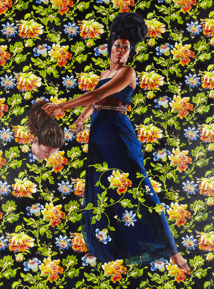
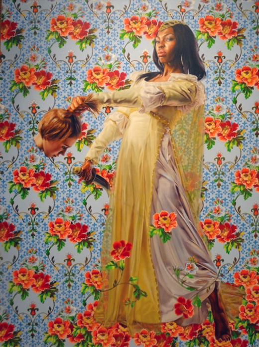
Two of Wiley’s pieces came back to haunt him. Curious people Googled his work and came up with “Judith Slaying Holofernes.” Without context, they (two pieces painted in 2012) smack of racism and terrorism. In context, they’re still unsettling. Which was Wiley’s point.
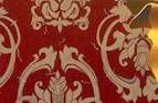
The concept is based on a story in the Biblical Book of Judith. A beautiful widow, distressed by her Jewish countrymen for not trusting God to deliver them from their foreign conquerors, gets an invading general drunk and decapitates him. She returns home with the ruler’s head, and his Assyrian following falls apart. The tale inspired dozens of European paintings depicting the horrific scene. (The 17th c. Dutch cornered the market on biblical horror.)
Wiley recast Judith as a black women and Holofernes—at least, his head—is that of a white woman.
Wiley did a great job on the contrast between the sienna and blues (cobalt and ultramarine) in the version of Judith where his model, Treisha Lowe from Brooklyn, wears a cobalt blue gown belted with leather and gold worthy of equestrian tack. (The same belt is featured in “Mrs. Waldorf-Astoria.”) He is a master of reflected light. He wields hues like a weapon.
The other painting presents Judith as a Capulet, young, powerful and sexy in a sparkly, form-fitting yellow gown. Of the severed head, Wiley told an interviewer from New York Magazine, “She’s one of my assistants.”
The public was horrified by the impression that their president wanted to destroy white America. I can see that, but, I don’t think that Barack Obama based his choice of Wiley on that image. However, I do think that he chose Wiley for his overall artistic philosophy and illustrative scope.
Critics explained that Wiley had attempted to illustrate how white culture’s appropriation of black culture might be turned against it. At the time he created the paintings, Wiley was more blunt. “It’s sort of a play on the ‘kill whitey’ thing,” he said, referring to a study by David Pizarro, a research psychologist at Cornell.
There’s only one thing worse than getting lost in cyberspace when I’m supposed to be writing: looking out the window of my art studio when I’m supposed to be painting. Assembled in front of my azaleas, feeders of all shapes and sizes attract a variety of birds. In fact, I had to buy a book to identify them all. I’ve seen male and female cardinals, blue jays, blackbirds, grackles, Carolina wrens, black capped chickadees, vireos, robins, flycatchers, sparrows, mourning doves, finches, mockingbirds, tufted titmouse, towhee, woodpecker, and warblers. And a few I can’t identify.
Of course, squirrels make a nuisance of themselves, but their antics are entertaining. They slide down feeder poles like drunken firemen, spin around on the hanging feeders like Tilt-a-Whirls, and chew peanuts upside-down from the mesh slots. Too often, I find myself fiddling with my zoom lens instead of painting.
A local art gallery association to which I belong challenged all of its members to shoot a photo of their studios and frame them. (“Egads,” I thought, surveying the stained rags, splattered floor, piles of boxes and paint cans, and dozens of portfolios vying for space in my studio. “What a mess! Who wants to look at this!”) Then, in the medium to which we artists are accustomed to working, create a piece inspired by our studios. It didn’t have to be something inside of the studio. Just inspired by it. The framed studio photos would hang next to the inspired pieces for an upcoming show.
Easy choice for me. My studio is completely banked by windows on the north. I feast my eyes upon azalea bushes, sassafras trees, pines, dogwoods and a redbud. I’ve collected a vast array of bird feeders, and to watch the birds feeding and flitting is a captivating retreat.
For this challenge, I wanted to paint as many bird species as possible, using a gold background of gingko leaves. (I planted a gingko tree in another part of the yard years ago; it’s still only three feet tall.) I knew that I wanted the design to take a circular motion, one that started with a cardinal smack in the middle and ended with something faint and tiny in the background.
Originally I’d named the painting “Birder Heaven,” but when my husband saw it, he exclaimed, “Oh, it’s an Angry Bird!” Well, that took care of that! “Angry Birds in the Garden” was a delight to paint, and as many paintings do, it evolved beyond what I’d foreseen. I can’t wait for the show to open.
In the meantime, I try to focus on my drawing board. It helps if it’s raining.
Note: I painted over this piece because I decided that I hated it. Check out “A Bird in the Hand is Much Better Than Two in the Bush.”


 In response to the question of whether the fame surrounding Michelle Obama’s portrait affected her life, Sherald said, “It did boost my confidence, only because I had been struggling for the longest time. You know you’re going to make it—everything was starting to fall into place—but it does kind of wear down on you when you’re in your 40s and you need to borrow money from somebody. You get these feelings of shame.”
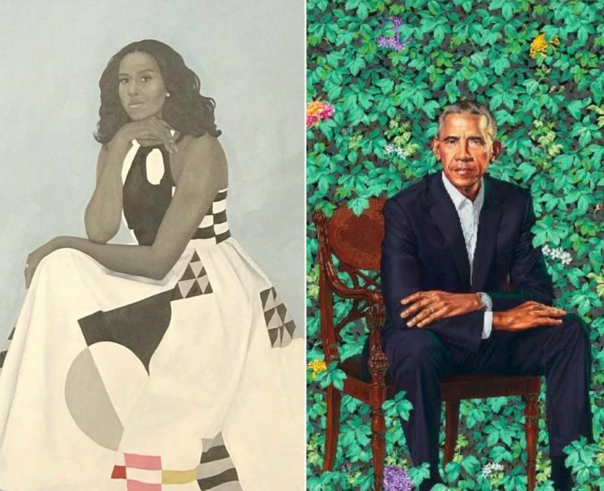

 who was a pulp and comic book illustrator.
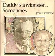
 Some of his pieces were strikingly similar to Wiley’s work, including detailed backgrounds and shocking switcheroos. But he died last year.
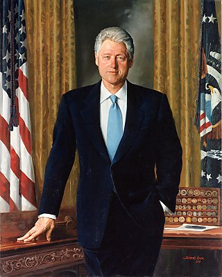
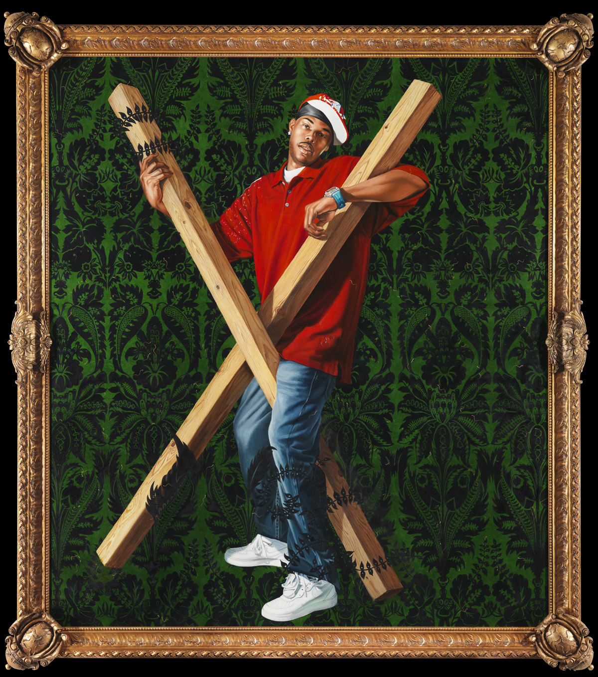 The piece, part of the Chrysler’s permanent collection, is, “St. Andrew,” a primarily green-and-red canvas bisected by an X that represents the cross of St. Andrews, but in the Latin position rather than that of the Roman crucifix. Ivy encircles the ends of the unbleached wood, subtly substituting for rope (rather than nails). The saint is replaced by a black, hip-hop guy wearing a do-rag under a red baseball cap. He straddles the cross in an almost dance-like pose. His gaze is off to the side, in one sense, implying fatigue, and other other hand, decidely dour.
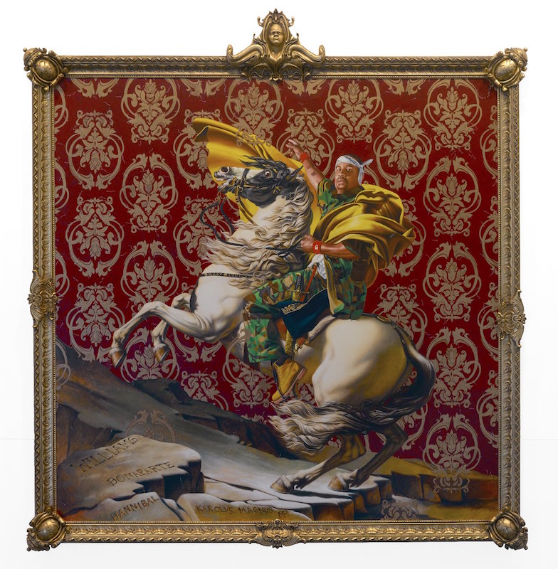 Williams wears camouflage clothing, a white bandanna tied on his head, and a huge, undulating, gold satin cape. The image takes its cue from the neoclassical Jacques-Louis David masterpiece of the same name. In this case, the painting elicited little public outrage because first of all, no one really cares for Napoleon, and secondly, because unless one looks very closely, one doesn’t know to be outraged, or at least, embarrassed. Swimming around the stylized, Baroque flowers are little sperm.