The exhibit, “Masterworks of American Impressionism,” just ended at the Peninsula Fine Arts Center in Newport News. How exciting to view works by Mary Cassatt, Childe Hassam, William Merritt Chase and John Singer Sargent among others. Photographs do not do justice. Neither do teachers who still, in the year 2014, insist that art is prettified repetition limited to an old fashioned textbook definition. “What is art?” one of the docents asked a group of school children recently. “It’s drawing inside the lines,” a wee one responded. Ouch. At least she brought her class to the gallery. “Drawing inside the lines” was a perfect, nearly scripted setup for the docent’s explanation. There is far more to art than staying inside the lines. In fact, the Impressionists did not stay often inside the lines, either linear, literal or figurative. The point of their movement was to blur the edges of tradition and realism, to take the viewer on a visual journey of emotion and texture and light, to create familiar subjects in a somewhat realistic manner that disintegrates into dots and squiggles and smears when the viewer stands close, forcing one to cry, “How did she do that?” Movement—the stroke of a brush or palette knife creates curves of paint that cup the light, blur the edges, launch motion. How to stay inside the lines when your intent is to create light? To emphasize a rounded form, transparent fabric, the glow of a sunlight through the curve of an ear? How to stay inside the lines, why to stay inside the lines when a wide, flat stroke of white on warm gray can create a 200 page book like the one being held by the reader in “Man Reading”? Yes, my favorite piece in the show. I just couldn’t stare at it enough. I wanted to devour it, as though the paint were whipped cream. That swift, sure touch of white to indicate the pages—pure genius. If the students who toured the exhibit came away with a smidgen of that idea, they will have learned more about art than all of their elementary school education combined.
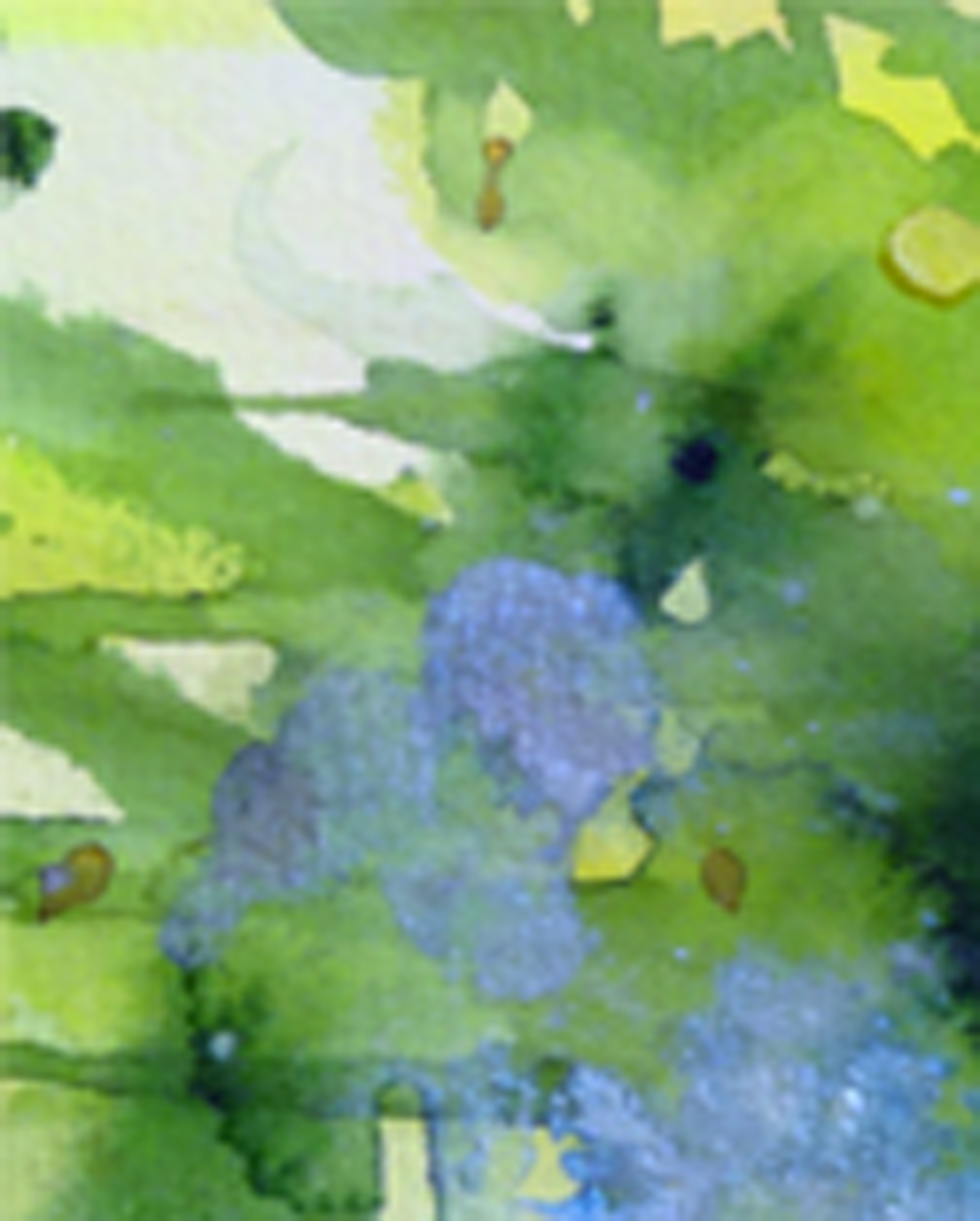
Cropped section of “Ah, Fantasy!” watercolor by Terry Cox-Joseph
The latest issue of W is flamboyant, mildly racy, quirky, creative and at times, articulate. The December issue is dedicated to modern art, both two- and three-dimensional, with an emphasis on fashion. No surprise then that George Clooney graces the cover. What is a surprise is that you can hardly see him, camouflaged as he is under layers of polka dots. Hand-painted dots of varying sizes cover his tux (or is it a suit? Does it matter?), his bow-tie, his shoes, the wall behind him, and inside the magazine, a vintage car. Gives you a serious case of amblyopia.
The art is fun and creative, albeit a nauseating example of a bad trip in the optometrist’s chair. To his credit, Clooney actually likes art, and his quotes are intelligent. He articulates the premise of his new movie, The Monuments Men, in a visceral sense to the point where I actually want to see it. And I don’t go to movies. “We question whether saving art is worth a life, and I would argue that the culture of a people represents life. When the Taliban destroy incredible pieces of architecture and art, or when American troops don’t protect museums in Iraq, you are seeing people losing their culture. And with the end of a country’s culture goes its identity. It’s a terrible loss, down to your bones.”
Polka dot perpetuator Yayoi Kusama, for all of her success and fame, is less articulate. “My idea is to send the message of ‘love forever’ to all the people of the world through the polka dots, which are all about the universe and human beings and living things.”
Really?
Voluntarily residing in a Tokyo psychiatric hospital, she unwittingly propagates the millennia-old concept that “real” artists see visions and cannot function in the real world. She is, however, functional enough to create an eye-popping body of work, hire photographers, arrange gallery shows, and pull off magazine interviews. She created a series of photographs where she inserted herself in layers of polka dots. The title: “Kusama’s Self-Obliteration.” Indeed. An art therapist would have a heyday with Kusama. Or run from the building in search of a pair of sunglasses.
I never played well with others as a student at Minneapolis College of Art and Design in the ‘70s. I didn’t sleep on bare cement floors, or cover my body with paint and smear my flesh across a huge roll of paper. I didn’t drop acid. Or even smoke. I was, in a word, dull.
Another thing that set me apart was my philosophy: you can make a living making art. 85% of successful artists (and writers and musicians, for that matter) are successful simply because they show up. Painful as that may be, it certainly holds true, despite the rancor of some “real” artists who continue to look down their polka-dotted spectacles on commercial art prostitution. How ironic, then, that such artists are often dependent upon commercial art for their art to be reproduced, advertised, and marketed. A necessary evil. And how ironic that artists like Julian Schnabel and Yoko Ono, whose core messages could take up a tenth of the space of a neon Post-It Note, are revered to the tune of millions of dollars. Most of the time, I have no idea what I’m looking at or listening to. This, coming from an artist who graduated cum laude.
I was taught that one of the tenets of good art is communication. If your audience walks away bewildered—worse yet, if they just walk away—you have not done your job. Therefore, many artists and designers go for the jugular. Grab the viewer—physically if necessary—and don’t let go. Fine, you’ve communicated. But what?
If the perfume, purse, shoe, jewelry or clothing ads are any clue, you must dress in black, expose your cleavage from nipple to navel, and look very, very mean. Ergo, if you love this shoe, you are tough and worldly and sophisticated. Or, just very rich.
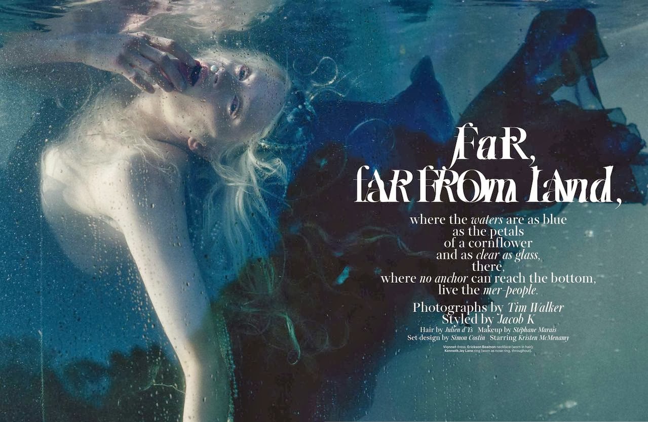
Later in the same issue is an 18-page spread (yes, 18 pages) featuring evening gowns and jewelry modeled by anorexic super model Kristen McMenamy—underwater. Or soporifically strewn across rocks. The copywriter insists that the gowns would make Disney’s Ariel squirm with envy. I disagree. The only thing she would envy is the paycheck. The gowns, most of which you can’t even see in the photos, look variously like barnacles, the ghost of Tudors past, and the remnants of a wet t-shirt contest. Mostly, you just want to stare at her bare breasts before you ferry her off to rehab. Kristen’s eyes and sclera are steeped in hideous rose madder. She is suspended lifelessly backward, with a pearl inserted into one nostril, another between her drowned, parted lips. Fishnet stockings (get it?) stretch over her ghostly white thighs. All of this further imparts the vital need for an immediate visit to the ER rather than a carefree shopping spree.
“Step and Repeat,” a 10-page fashion feature, is lighthearted and entertaining. Overly patterned model-mannequins prance in Oscar de la Renta, Marc Jacobs and Gaspar. Faces are hidden beneath Maison Martin Magella Artisanal masks (no eyeholes or breathing apparatuses in those Christmas lights and retro-‘50s flower pins?). Thank God it was photographed on a white background. I wonder how many models can claim this shoot in their portfolios. After all, you can’t see their faces.
How then, did an ad with a raw, earthy close-up of a middle-aged Detroit seamstress end up in the center of this otherwise otherworldly scree? Shinola, “Where American is made,” reads the ad. Now they’ve done it: the company has stabbed us in the gut with a huge political statement. These are the people who actually sew many of the clothes these models wear. These are the bespectacled, overly permed, wrinkled matrons whose arthritic and experienced hands craft reality from fantasy.
I gasped when I first saw he photo.“How did Mary Whyte’s work get into W”? I thought. Whyte is the creator of “Working South,” a series of watercolors that feature on-site portraits of the individuals who make up a class of dying blue collar industries in the American South—textile mill workers, tobacco farmers, an elevator operator, a shoeshine man, an oysterman, a New Orleans style funeral band. Her steady hand creates portraits so real, you can almost smell the workers’ sweat, finger the grooves of their wrinkles. Yet her sense of composition and artistry allow her to leave the backgrounds and clothing unfinished, suggested merely by cobalt drips, sienna streaks, and avocado puddling. Now this is art.
Artist/novelist Jonathan Santlofer, where are you when we need you? Gotta knock off some of these big-name stylists. But not until I buy the Chanel “Camelia Brode” diamond watch on page 24.
Dijbouti. Suez Canal. Night vision goggles. Combat rescue. Cargo ships. International flights. Missed flights. Arab culture. Clans. The mechanics of heat and missile speed. All the things a good writer should know. Like David L. Robbins. And me.
Me?
Yes, I write. And I don’t write in the genre of David Robbins. Good thing, because not only would I never be able to steer a ship the size of five football fields under the smile of a whimsical, indulgent Arab captain (I am, after all, a woman), I would never be able to keep pace with David Robbins, who has the energy of five cruise missiles and the stamina of five football teams.
I felt like I’d had five cups of coffee after I’d listened to his talk at Christopher Newport University today.
To say that I enjoyed his talk immensely would be an understatement. To say that I felt inadequate would be, too. I write about art. Family. Gardening. Health care. Mental illness. Asperger’s. A bit of science fiction. And yes, I have had a short story published about an honor killing in Pakistan.* I blush to think that I had to look up the spelling of Kalashnikov. David Robbins I am not.
I focused on the protagonist as a woman in a harsh and unfair culture, a woman as a mother and a poet, a pure spirit, an individual. I researched the type of food a typical, if poor, Muslim housewife would make in Pakistan, the smells of that food, the smells and colors and noises of the marketplace she so seldom sees. I focus on the place she hides her forbidden poetry–so near, so intimate, and so undiscovered–beneath the bed in her own home. I write about the beautiful embroidery she stitches to sell behind her husband’s back.
These are the things I know. These are the things I weave into a story of willpower, family, betrayal, terror, despair, faith and love.
And then it dawned on me, why should I be David Robbins? I have no desire to aspire to his scope of of travel, level of production or genre. “Write what you know” is a well-worn phrase, to the point of cliche’, but it is so true. I know art. I know embroidery. I know marriage. I know children. I know nature. I know dogs, cats, and horses. I know what it feels like to stitch in haste, to prick my finger with a needle, then observe a single drop of dark red blood spring from my fingertip like magic, to wonder what would happen if my blood were diseased, or if I accidentally smeared it on an expensive fabric that were to be given as a gift to a head-of-state, or if I licked it and found that I’d developed a desire and addiction for it.
It doesn’t take a whole lot to send my imagination into a flight of creativity, a what-lf situation that leads to a story or a description that leads to a poem or painting. I take it for granted; I was born that way.
So with David Robbins in mind, and not in spite of his animated, high spritited adventures and his engrossing story telling skills, I continue with my smaller life, my quiet paintings, my detailed descriptions. Shame on me for thinking I have to keep up with the Joneses of the writing world. There is no need to run to keep up with the keyboard. I only have to make sure that it’s there, waiting, each time I’m ready for it. I only need to keep pace with myself.
The colors I eat are mostly browns and tans … oatmeal with dark brown sugar, chicken with Italian spices, baked potatoes with the skin covered in olive oil and sea salt. The best form of brown, even from Martha Stewart and Sherwin Williams, is the warm brown of chocolate—hazelnut, milk, organic dark, and extra dark. I’m supposed to eat a palette of colors—green for iron, orange for eyesight, and I remember the carrots and beans in my mother’s homemade vegetable soup, colors of fall and winter and warmth and fullness. Like the leaves outside the front door, our red maple and the neighbor’s oak, the bright yellow of willows whose bark peeled and curled with character and familiarity.
It never occurred to me to eat by color until I met my mother-in-law, who cooked from difficult magazines like Gourmet, each meal an experiment in organic chemistry, portions measured perfectly, colors like a palette to soothe the palate. Imagine, me, an artist, ignorant of a food palette! Oh yes, I’ve made up for lost time, but when things get tough, I always fall back on basic essentials and routine. Chocolate, smooth and full, resting on my tongue like an ocean of flavor, while I float away on the restful tide.
I knew when I painted the huge (30″ X 40″) acrylic of my daughter in a summery, sunglasses, tank top pose, getting into a car, that the proportions were wrong, but I was on deadline for a show entry. I just needed the image to be sharp, bold and attractive enough for a photo and email entry, and I could work out the kinks later.
I was overjoyed that the work was accepted.
Now, for the hard part.
I loved the mouth and the face. My favorite parts. But the head, overall, was too small. The rest of the body, such as the arm, then the purse, as well as the car, had been worked out proportionately, so my only choice was to paint over the face.
Sigh.
She ended up with a gaping black and red smile that looked like the Joker, aka Jack Nicholson. The perfect reflected light and shadows on her chin were painted over and enlarged. I am about a third of the way there.
Part of me is disheartened. Part of me is excited. I love to paint, and I love this painting. Trained as an illustrator, my background involves 00 (double-ot) Rapidographs, ruling pens, and T-squares. Large paintings involve a lot of large brushstrokes, then standing back several paces to obtain a true view.
It helps to loosen up with a glass of wine, too. And chocolate. No salesmen or corporate clients to worry about messy fingerprints on pristine illustration board.
So much of my life is like this now–redoing, using broader strokes, standing back to assess my progress. I can’t help but wax philosophical and consider that it is a good thing. I’ve got years of training under my belt. Teeny-tiny, detailed illustrations, drawn and re-drawn to clients’ specifications, published in the form of calendars and matchbooks. Cleaned typefonts, enlarged from aforementioned matchbooks, enlarged to 20 times their size, meticulously sculpted, then reduced and re-photographed. Pica measurements. Darkroom stats, printed too quickly, then cleaned up with White-Out on deadline.
I’ve earned this freedom, this joy. And it shows. This painting, and others like it, have a sense of life to them that was lacking in my older, scripted work.
I hope that this sense of joy and freedom, built on accomplishment, spills over to other areas of my life–parenting, caregiving, organizing, cooking, volunteering. Whenever I feel my neck tighten up, or my temper flare, I remind myself to walk softly and carry a big paintbrush.
It feels good.
How to decide whether to write or paint each day? Some days are filled with deadlines. Others are more open. Roman poet Horace said that “A picture is a poem without words.” Join me in my poetic journey where I pontificate on politics, wrestle with my son’s Asperger’s or my Dad’s Alzheimer’s, absorb myself in gardening, commisserate on cats and dogs, and take joy from my works of art, whether acrylic, oil, watercolor or pen and ink. Art and writing have been my lifelong passions. How lucky I am to love my work. As Kahil Gibran said: “Work is love made visible.”