Parting is Such Sweet Sorrow

Of all the philosophies and theologies I have learned, the most difficult is the idea of impermanence. Think, Buddhism and Hinduism.

Most people have heard about or witnessed the creation of Buddhist sand mandalas. On the other hand, few have witnessed the erasure that follows. The erasure is a ceremony unto itself, symbolizing the temporary place that we and all life on Earth hold.

Over the years, much to my dismay, several of my murals have been painted over. I had hoped they would remain until long after I had passed. I have learned to accept some of this impermanence, mostly because there’s usually another commission or gallery opening just around the corner. Still, I yearn for some kind of immortality through my art.

My first restaurant mural actually had a long lifespan. I had decorated all four walls of a local Italian restaurant. The less-oft’ viewed back of St. Peter’s Basilica; the crumbling Coliseum; romantic couples in gondolas with laughing children racing across the bridges overhead; horses sporting brightly colored headdresses, pulling equally bright Sicilian carts; an Italian phrase that echoed our oft recited, “Eat, Laugh, Live,” (and which I had to research with help from the local university); and even the iconic fingertips of Michelangelo’s “The Creation of Adam” over the dessert freezer (what more appropriate spot?).

For years, my family, friends and locals reveled in the authenticity of the Sicilian family’s recipes, with my artwork as a backdrop. But the neighborhood changed. Mama Lina’s closed its doors.

A couple of weeks later, perhaps with a touch of masochism, I stopped by. A half-dozen white, work trucks were parked outside and the sound of drills and hammers echoed throughout the empty space. I walked through entryway, once decorated with a vine-covered lattice arch, to see only whitewashed walls. Stark. Eerie. Depressing. Almost dreamlike, in a nightmarish sort of way.

As I stared at the blank spaces that had once danced with life, workmen came up to ask me if I was the artist.

“How did you know? 

“The way you walked straight in and stared at the wall,” one of them said. Of course. Who else would walk into someone else’s business, uninvited, and stare at all the blank walls? They were sympathetic, and even asked for my business card. But they had a job to do.

Another restaurant hired me to paint numerous Egyptian scenes on wood-stained clapboard—no easy feat. I first had to prime the area. While that was drying, I sketched scenes from various internet travel sites, merging each as it moved along the wall. The iconic Egyptian pyramids; sparkling gardens and lush, tropical flowers; women carrying basketsful of fruit atop their heads; and a twist on the traditional, tourist camel ride—the owner and his family atop the camels. Each family member posed, an exercise that added many hours to my work.

They did a good business for a while. But the location never stuck. Attempts to make it into a nightclub flopped. I heard rumors that they may close and so I made a trip over, only to find the camel scene marred. Someone had whitewashed the family’s faces. I never returned to witness the complete erasure.

Admittedly, I have destroyed some of my own artwork. My skills have improved. Some items were water damaged. And I don’t need three portfolios of college work. Still, my stomach does a little flip each time one of my works ends up in the landfill or hidden beneath four coats of Kilz.

All things have a lifespan. Cars. Buildings. Glaciers. Magazines. Medicines. And, of course, humans. I have, through necessity, adopted a more laisse faire attitude toward the sometimes-transient nature of my work.

And when I hit a real low, I pick up my brush and start again. I can always create something new.

Advertisement

Image

Artkill

No. Just no.

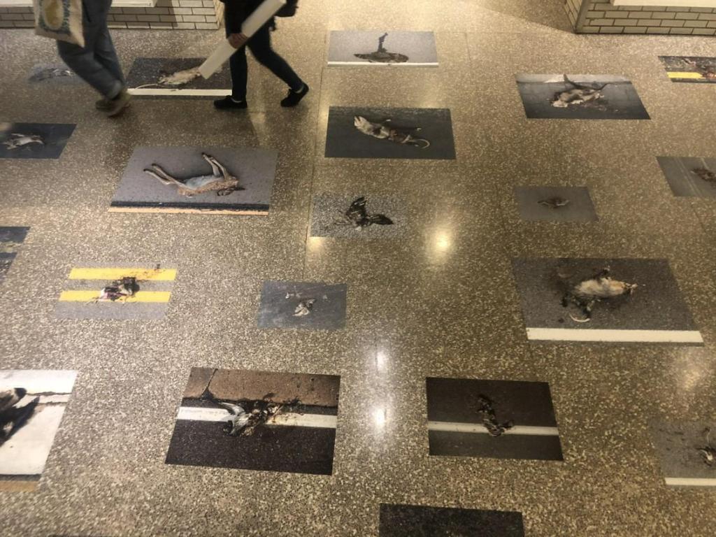
Roadkill photographed and adhered to a lobby floor is not art.

To explain: Minneapolis College of Art and Design senior Hannah Andersen in 2019 won a Merit Scholarship from West Photo for $4,000. A merit scholarship is described as work based on students’ displays of their work. Each year, a jury of MCAD faculty members awards Merit Scholarships to participating students in a variety of categories.*

I hate to criticize “one of my own,” as it were. Especially from my alma mater. But then, maybe that’s why it pains me so much. I expect more art, more intellect, less shock value. MCAD’s mission statement is, “Where Creativity Meets Purpose.” Really? What is the purpose of this display?

Call me cynical, but by the time I was a senior, 75 percent of my class had dropped out. Of those who graduated, half got and kept jobs in the fields of art, design, photography,  or theater. To its credit, MCAD’s 21st century course selections include a slew of computer courses as well as a major in Entrepreneurial Studies. If Ms. Andersen’s future lies in editorial photography, she may do well. But as art qua art, her senior project is a bust. Aesthetics, 0. Shock value, 10. The faculty who nominated her has questionable values and even more questionable eyesight in regard to art. Design, meh. A loose grid pattern is inarguably a design.

The room-sized, life-sized exhibit packed a punch. As in, the gut. Feathers crushed and smeared on asphalt; bloodied entrails of a rabbit; comatose squirrel; smashed snake. You get the idea.

Without having to define art, and even without a common aesthetic, this display is clearly not art. Does it involve hard work? Yes. Photography skills? Yes. Initiative? Certainly. Creativity? More-or-less. I have heard more than one person suggest, over the years, “Wouldn’t it be funny if someone photographed road kill and called it ‘art’?” That a senior at MCAD actually executed the idea does not lend it any creativity.

In 2008, Marc Seguin featured a show entitled, “Roadkill” at New Charest Weinberg Gallery, Miami. His oversized pieces consisted of taxidermied animals such as a wolf and quail interacting with humans. One painting displays a moon-type sphere in transparent white on a background of warm beige. From it hangs an upside-down quail. Blood from an outstretched wing drips down the otherwise blank canvas. Another piece features a man free-falling, face-down, inches above a double-image coyote, muzzle open, preparing for contact. Clearly, these are conversation pieces, editorial pieces, artworks. This is interpretive art. https://www.designboom.com/art/marc-seguin-at-new-charest-weinberg-gallery-miami/

Not all art is beautiful. Picasso, Goya and many others have established that. But something as common, albeit sad, as roadkill, in and of itself, doesn’t have enough editorial content on the face of it to even place it in context. I have thought and pondered and what-iffed Andersen’s MCAD Roadkill series. Roads and roadkill exist outside; the display existed inside. So the display was taking an uncomfortable fact of life and making it more uncomfortable. To what end? Roads and roadkill are man-made. So? Squirrels, birds, snakes and possum are trampled by horses and killed by hail, too. What makes this so special? So creative? Why not paint them instead of photograph them? Why simply place them on the floor for people to walk on or around?

I give up. I’m too blinded by the shock value of exploding guts to appreciate this intersection of nature, humans, and photography. It all makes me feel as though art and culture are on a collision course. In the meantime, I’ll take my car through the carwash, just in case any remnants of contemporary art are stuck to the front grille.

https://mcad.edu/features/2019-merit-scholarship-winner-hannah-andersen

*Just in case someone should conjecture that I am sour grapes about not receiving a Merit Scholarship, I did receive a tuition scholarship during my second semester at MCAD. It was based on grades and performance. I hold no grudge against Ms. Andersen. I just don’t understand or appreciate this kind of art and design.

The Obama Portraits Part II

Michelle’s Sort-of-Portrait
Michelle Obama Portrait

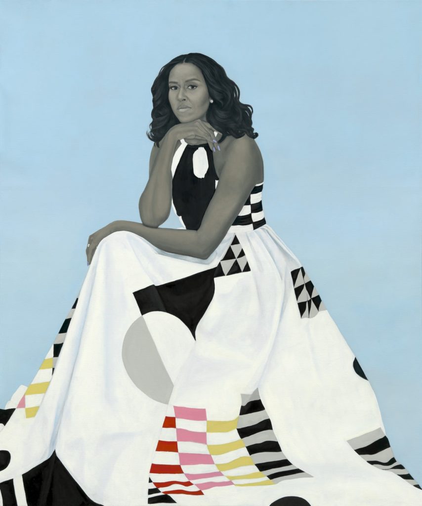
And now for Michelle’s portrait. A disappointment. A designer piece, like the dress it depicts, from Michelle Smith’s fashion line, Milly. The dress is striking, a contemporary statement piece with its bold, graphic design. And that’s how I see Michelle. But I do not see her likeness. I see the shape of her face. The beginnings of a portrait. If I were First Lady, regardless of ego, I would expect my portrait to look like me, not just to represent me. But I’m not Michelle Obama.

Some reviewers claim that she and Amy Sherald chose the dress together. Others surmise that Michelle Obama picked it out and it was sent to Sherald as reference material. Interestingly, while most of Smith’s sketches are signed with the date and her initials, or a comment like, “Fall Line,” this dress is signed “XO.” Hugs and kisses?Michell Obama Michelle Smith Milly Dress
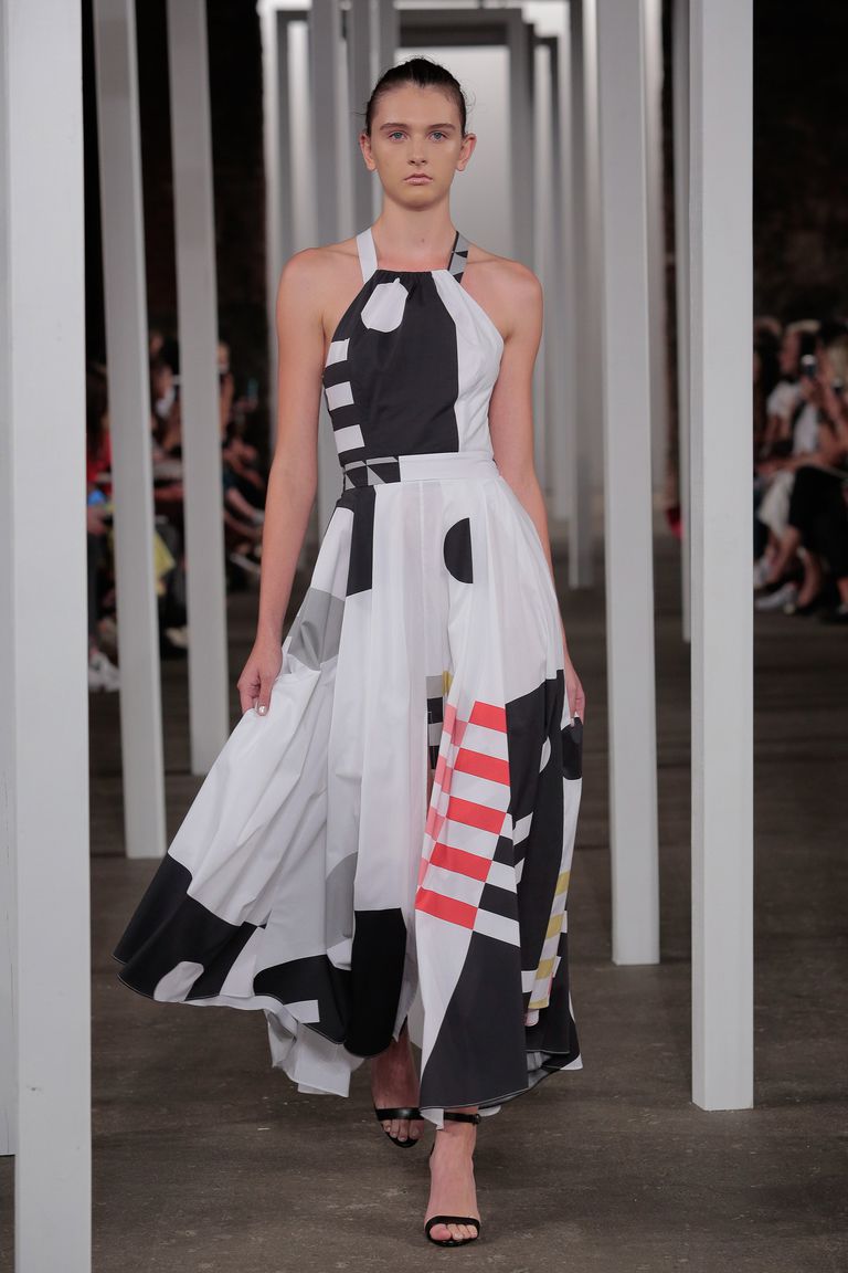
Sherald commented, “It has an abstract pattern that reminded me of the Dutch artist Piet Mondrian’s geometric paintings. But Milly’s design also resembles the inspired quilt masterpieces made by the women of Gee’s Bend, a small remote black community in Alabama where they compose quilts in geometries that transform clothes and fabric remnants into masterpieces.” (Hannah Morrill, Elle, February 13, 2018.)

Interestingly, Smith herself says it was meant to be “a dress that Mrs. Obama could wear in her everyday life, as well as in this iconic portrait.” The designer adds, “It’s made of a stretch cotton poplin print in a clean, minimal, geometric print without a reference to anything past or nostalgic, which gives the dress a very forward-thinking sensibility—this is very Michelle Obama.” (Brooke Bobb, Vogue, February 12, 2018.) (Italics are mine.)

Michelle loved that the painting is iconographic. “As a young girl, even in my wildest dreams, I never could have imagined this moment,” she wrote on Instagram. “Nobody in my family has ever had a portrait — there are no portraits of the Robinsons or the Shields from the South Side of Chicago. This is all a little bit overwhelming, especially when I think about … so many young girls and young girls of color who don’t often see their images displayed in beautiful and iconic ways. I am so proud to help make that kind of history. ” (Brittany Packnett, The Cut, February 2018.)

Some History

Yes, she has made history. But I wish that someone had told Michelle that a good portrait should do both—look like the sitter and represent the sitter. As in Diego Rivera’s work, which struggled beneath the artist’s difficulty with foreshortening and likeness, it is the message that counts. Any problems with visual perspective or proportion became so embedded into his oeuvre as to be trade symbols. “Oh, that’s a Diego Rivera mural,” or “Look at that Amy Sherald painting.” They conjure imagery, concepts and politics—but not necessarily mastery of the human figure or portraiture.

Sherald’s signature gray fleshtone is a mixture of black and Naples yellow, which she says was suggested by a colleague to remove the silvery, flat tone of black-and-white. (A great hue idea I may borrow.) She dresses her figures in a variety of bright clothing, using a background of muted and blended or solid color. Amy Wong writes for Medium, “This is Sherald’s signature style. Her paintings of African Americans are anonymous. They resemble their subjects, but at the same time, they do not.” Sherald is quoted by Dorothy Moss of the National Portrait Gallery as saying, “Once my paintings are complete the model no longer lives in that painting as themselves. They have become something bigger, more symbolic. . .” Which is exactly why it is not a portrait.

Nor, to her credit, does she call herself a portrait artist.

Portrait artists have historically fudged their data, but not for her reasons. They had to or, as in the case of the last portrait of King Henry VIII, they would have been beheaded. (King Henry wanted to look younger and thinner. He sent the artist back to the drawing board several times. One can image what the king really looked like if his last portrait was flattering!) The portraitist’s job was to show royalty and the wealthy at their finest. It was designed to inspire awe and create a representation of power or valor. Still, anyone looking at the portrait should recognize the individual. Will people recognize Michelle in her portrait in 50 years? Will the American public be better educated on contemporary art in 50 years?

“Michelle is painted as if in a black and white photo,” Wong says. “Sherald has said that she does this to remove color as race.” What Sherald actually said was that she uses gray tones “to exclude the idea of color as race from my paintings by removing ‘color’ but still portraying racialized bodies as objects to be viewed through portraiture. These paintings originated as a creation of a fairytale, illustrating an alternate existence in response to a dominant narrative of black history.” (Joan Cox and Cara Ober, BMoreArt, November 29, 2017.)

Wong goes on to say, “Historically, black people have not had paintings to represent them. Only photos exist.” Wong is totally wrong. She took Sherald’s quote out of context. Wong apparently believes that only American images of black Africans exist in black-and-white photographs after the invention of the camera. While Sherald did say that she uses old black-and-white photos for inspiration, Wong missed Sherald’s operative word: “Narrative.” Wong should also have inserted, “American.”

One only has to look at one of hundreds of portraits of the biblical three kings after Jesus’ birth to find black Africans painted as they looked (i.e. not caricatures, as Wong insists). Black royalty in Europe, Egypt and central Africa has been represented in bas relief and with coins since the second century A.D. and in portraits since medieval times. For fun, check out this link, to read about a woman who researches black Tudors: https://www.historyextra.com/period/tudor/black-tudors-60-seconds-with-miranda-kaufmann/

Wong goes further afield to say, “As for Michelle Obama’s portrait, there has not yet been a gallery in the Smithsonian that is devoted to showing the portraits of first ladies. After a temporary installation, Michelle’s portrait will most likely end up in storage. In this case, art follows life.” This is pure fiction. Anyone (except Wong) would have surmised that such an iconic portrait would be purchased and donated. It has been shown at the National Museum of Women in the Arts in Washington, D.C., where Sherald gave a talk, and now hangs in the Smithsonian.

To quote the Smithsonian website, “On February 13, 2018, the commissioned portraits of the 44th President, Barack Obama, and First Lady Michelle Obama were installed in America’s Presidents and Recent Acquisitions, respectively. Mrs. Obama’s portrait has been relocated and can now be seen in the 20th Century Americans exhibition on the third floor.”

Ironic Icon

Sherald’s quote now becomes ironic. “… the model no longer lives in that painting as themselves. They have become something bigger, more symbolic. . .” Of course, Michelle Obama has now become a symbol of achievement for black, American women. But one has only to look at Sherald’s body of work to see that all of her paintings are those of individuals: One wears glasses. One is thin. One has fuller lips. One has a narrower jaw. One’s eyes are closer together. Each one is unique, as is Michelle; Sherald even gave her the blue fingernail polish she wore at the 2012 Democratic National Convention.

We are, each of us, different. We are individuals. Sherald is painting individuals who represent the black community. But even as a whole, the community is not a collective. Because we have grouped human races into categories should not mean that we are interchangeable replicas.

A bit about Amy Sherald

 Sherald was raised conservatively and broke out of her fundamentalist religious upbringing, which led her to question her role in society as a black female. It was clear that white supremacy had laid the cultural groundwork, that social movements had changed it, but she felt she was past that, and did not want to be confined by contemporary, angry black narrative, either. Her figures exude a sense of self-assurance, as compared to Wiley’s figures, who exhibit everything from anger to bravado to intimidation. (With the exception of Obama, who exhibits a calm intensity. A subtitle could be stolen from August Rodin— “The Thinker.”)

Award-winning Sherald’s curriculum vitae is stellar. She has received residencies in Panama, Norway and Beijing, China. In 2012, Sherald, who suffered from cardiomyopathy, underwent a heart transplant. She signed a release form accepting the potential of danger from a high-risk patient. Later, she found out that her new heart belonged to a woman who had overdosed on opioids.
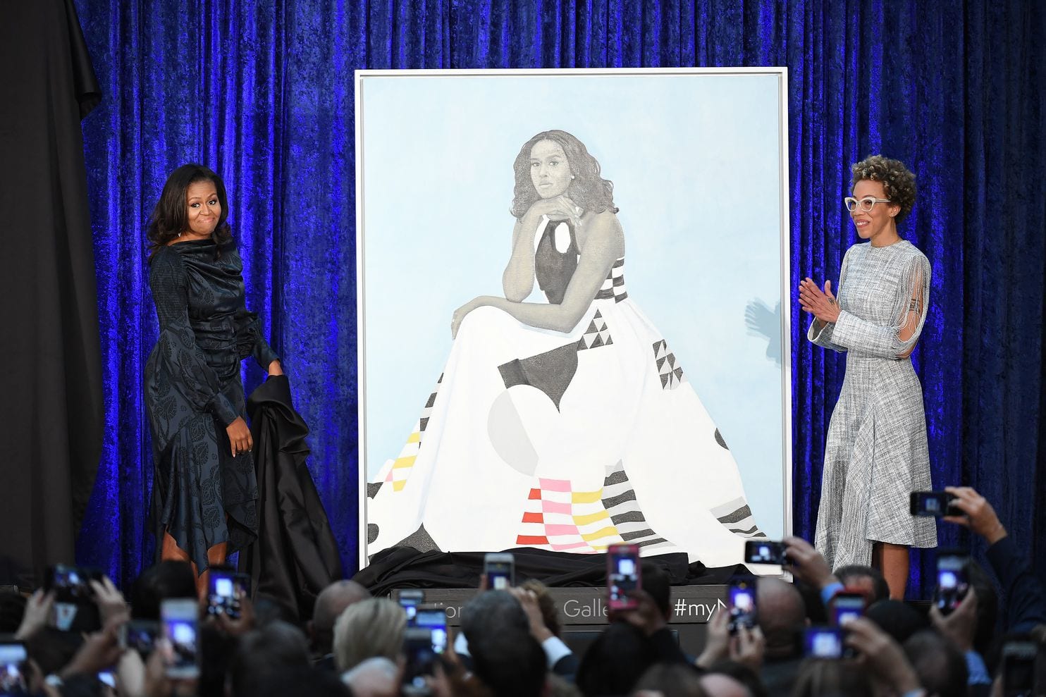
Michelle Obama Portrait with Michelle and Amy SheraldIn response to the question of whether the fame surrounding Michelle Obama’s portrait affected her life, Sherald said, “It did boost my confidence, only because I had been struggling for the longest time. You know you’re going to make it—everything was starting to fall into place—but it does kind of wear down on you when you’re in your 40s and you need to borrow money from somebody. You get these feelings of shame.” (Sarah Cascone, June 20, 2018, Artnet News.)

And That’s What it’s all About

 The Obamas’ portraits create a conflicting narrative. Where past presidents commissioned portraits by bona fide portrait artists, the Obamas chose museum-geared, contemporary artists. Where past presidents preferred exact likenesses in settings with familiar accoutrements, the Obamas sought broader statements.

Now that time has eased the eyebrow-raising aspect of the portraits, I am amused and pleased by the Obama’s choices of contemporary artists. But I am also saddened.

Because of the Obamas’ life experiences and race/color, as well as their philosophy, they chose to be “everyman” and “everywoman” in their portraits, particularly to the black community, and thus sublimated the fact that like the artists they chose, they had to work to achieve. In attempting to be a part of the multitude, they lost sight of their individualism (Michelle, in particular, because of the lack of resemblance). The president and first lady are figureheads, but they are also exceptional individuals.

Michelle Obama’s portrait has not been disassembled as much as, say, a Picasso. Mostly, it has been de-personified. I see only a pretty lady in a knock-out dress.

“They’re portraits whose subjects care about aesthetics, who are thoughtful about the history of portraiture, and who have the personal charisma to carry the weight of that history on themselves. … Which is important, because history is going to weigh heavily on the portraits of the first black president and first lady, painted by the first black artists commissioned to make the official presidential portraits.” (Constance Grady, Vox February 12, 2018.)

Wait! What about Simmie Knox? Ahh—because he is a professional portrait artist, he has no “narrative.” His blackness has already been forgotten. Talk about de-personifying.

By choosing Kehinde Wiley, who has embraced in-your-face imagery and utilized stinging satire, former President Barack Obama angered a vast swath of his country. As much as Barack Obama attempted to heal, he hurt.

Ironically, the idiom, “A picture paints a thousand words” couldn’t be more apt for two portraits that left many Americans speechless.

We all view life through our own filters. But when one is president, he needs to provide direction and connectivity. For many, the Obamas choices of portrait artists caused confusion and disconnection.

Abraham Lincoln’s famous quote (written originally by Poet John Lydgate) couldn’t be more apt here. “You can please some of the people all of the time, you can please all of the people some of the time, but you can’t please all the people all of the time.”

I would guess that future presidents will choose traditional portraits. In the meantime, these pieces remain peculiar, 21st century archetypes.


What in the World, W?

The latest issue of W is flamboyant, mildly racy, quirky, creative and at times, articulate. The December issue is dedicated to modern art, both two- and three-dimensional, with an emphasis on fashion. No surprise then that George Clooney graces the cover. What is a surprise is that you can hardly see him, camouflaged as he is under layers of polka dots. Hand-painted dots of varying sizes cover his tux (or is it a suit? Does it matter?), his bow-tie, his shoes, the wall behind him, and inside the magazine, a vintage car. Gives you a serious case of amblyopia.

The art is fun and creative, albeit a nauseating example of a bad trip in the optometrist’s chair. To his credit, Clooney actually likes art, and his quotes are intelligent. He articulates the premise of his new movie, The Monuments Men, in a visceral sense to the point where I actually want to see it. And I don’t go to movies. “We question whether saving art is worth a life, and I would argue that the culture of a people represents life. When the Taliban destroy incredible pieces of architecture and art, or when American troops don’t protect museums in Iraq, you are seeing people losing their culture. And with the end of a country’s culture goes its identity. It’s a terrible loss, down to your bones.”

Polka dot perpetuator Yayoi Kusama, for all of her success and fame, is less articulate. “My idea is to send the message of ‘love forever’ to all the people of the world through the polka dots, which are all about the universe and human beings and living things.”

Really?

Voluntarily residing in a Tokyo psychiatric hospital, she unwittingly propagates the millennia-old concept that “real” artists see visions and cannot function in the real world. She is, however, functional enough to create an eye-popping body of work, hire photographers, arrange gallery shows, and pull off magazine interviews. She created a series of photographs where she inserted herself in layers of polka dots. The title: “Kusama’s Self-Obliteration.” Indeed. An art therapist would have a heyday with Kusama. Or run from the building in search of a pair of sunglasses.

I never played well with others as a student at Minneapolis College of Art and Design in the ‘70s. I didn’t sleep on bare cement floors, or cover my body with paint and smear my flesh across a huge roll of paper. I didn’t drop acid. Or even smoke. I was, in a word, dull.

Another thing that set me apart was my philosophy: you can make a living making art. 85% of successful artists (and writers and musicians, for that matter) are successful simply because they show up. Painful as that may be, it certainly holds true, despite the rancor of some “real” artists who continue to look down their polka-dotted spectacles on commercial art prostitution. How ironic, then, that such artists are often dependent upon commercial art for their art to be reproduced, advertised, and marketed. A necessary evil. And how ironic that artists like Julian Schnabel and Yoko Ono, whose core messages could take up a tenth of the space of a neon Post-It Note, are revered to the tune of millions of dollars. Most of the time, I have no idea what I’m looking at or listening to. This, coming from an artist who graduated cum laude.

I was taught that one of the tenets of good art is communication. If your audience walks away bewildered—worse yet, if they just walk away—you have not done your job.  Therefore, many artists and designers go for the jugular. Grab the viewer—physically if necessary—and don’t let go. Fine, you’ve communicated. But what?

If the perfume, purse, shoe, jewelry or clothing ads are any clue, you must dress in black, expose your cleavage from nipple to navel, and look very, very mean. Ergo, if you love this shoe, you are tough and worldly and sophisticated. Or, just very rich.

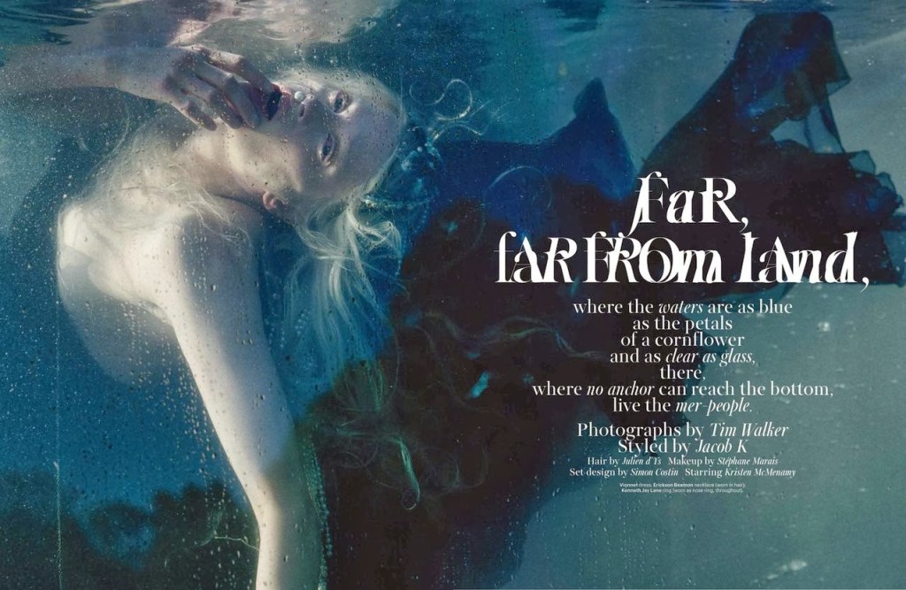
Later in the same issue is an 18-page spread (yes, 18 pages) featuring evening gowns and jewelry modeled by anorexic super model Kristen McMenamy—underwater. Or soporifically strewn across rocks. The copywriter insists that the gowns would make Disney’s Ariel squirm with envy. I disagree. The only thing she would envy is the paycheck. The gowns, most of which you can’t even see in the photos, look variously like barnacles, the ghost of Tudors past, and the remnants of a wet t-shirt contest. Mostly, you just want to stare at her bare breasts before you ferry her off to rehab. Kristen’s eyes and sclera are steeped in hideous rose madder. She is suspended lifelessly backward, with a pearl inserted into one nostril, another between her drowned, parted lips. Fishnet stockings (get it?) stretch over her ghostly white thighs. All of this further imparts the vital need for an immediate visit to the ER rather than a carefree shopping spree.

“Step and Repeat,” a 10-page fashion feature, is lighthearted and entertaining. Overly patterned model-mannequins prance in Oscar de la Renta, Marc Jacobs and Gaspar. Faces are hidden beneath Maison Martin Magella Artisanal masks (no eyeholes or breathing apparatuses in those Christmas lights and retro-‘50s flower pins?). Thank God it was photographed on a white background. I wonder how many models can claim this shoot in their portfolios. After all, you can’t see their faces.

How then, did an ad with a raw, earthy close-up of a middle-aged Detroit seamstress end up in the center of this otherwise otherworldly scree? Shinola, “Where American is made,” reads the ad. Now they’ve done it: the company has stabbed us in the gut with a huge political statement. These are the people who actually sew many of the clothes these models wear.  These are the bespectacled, overly permed, wrinkled matrons whose arthritic and experienced hands craft reality from fantasy. 

I gasped when I first saw he photo.“How did Mary Whyte’s work get into W”? I thought. Whyte is the creator of “Working South,” a series of watercolors that feature on-site portraits of the individuals who make up a class of dying blue collar industries in the American South—textile mill workers, tobacco farmers, an elevator operator, a shoeshine man, an oysterman, a New Orleans style funeral band. Her steady hand creates portraits so real, you can almost smell the workers’ sweat, finger the grooves of their wrinkles. Yet her sense of composition and artistry allow her to leave the backgrounds and clothing unfinished, suggested merely by cobalt drips, sienna streaks, and avocado puddling. Now this is art.

 Artist/novelist Jonathan Santlofer, where are you when we need you? Gotta knock off some of these big-name stylists. But not until I buy the Chanel “Camelia Brode” diamond watch on page 24.

http://magazine-photoshoot.blogspot.com/2013/12/kristen-mcmenamy-by-tim-walker-magazine.html