Backstory
Now that the furor is over and the portraits are hung, I’ll weigh in on the “scandalous” presidential portraits at the Smithsonian’s National Gallery.
Numerous people were astonished by the images and artists chosen by former President Barack Obama and his wife, former first lady Michelle Obama. Why? Firstly, because they are contemporary art, by artists Kehinde Wiley and Amy Sherald. Neither portrait is a simple oil rendering of the face of a leader. Secondly, because they are difficult to understand. For the same reason. This is the first time any sitting president has chosen a contemporary artist over a traditional portrait artist for his portrait in the National Gallery. It is the first time any sitting president or first lady has chosen artists who interpret the subject in a wholly different way. Imagine Surrealists Marcell Duchamp or Helen Lundeberg doing Truman’s presidential portrait. Thirdly, because they are political. Aren’t all presidential portraits? Not as much as these.
Wiley’s and Sherald’s points-of-view are not so much portraiture as figurative intellectualism and archetypes. That works in museums, but not so much in presidential portraiture. It simply comes off as peculiar. (Critic Ben Davis uses words like “weird” and “fanciful” in his ArtNet review.)
Another way to Choose an Artist
Both Obamas chose black American artists. That makes sense: why not seize that opportunity? But judging from the scarcity of black artists on Google and in The Portrait Society of America, choosing a black portrait artist of renown is no easy feat. (The Smithsonian submitted a list of choices to the Obamas.) The Smithsonian has a wonderful collection of African American art created by over 200 African American artists (https://americanart.si.edu/art/highlights/african-american), but these are primarily social commentaries, not portraits. It’s a subcategory within a subcategory within a subcategory.
Did the Obamas have to choose a portrait artist? No. They stepped out of everyone’s comfort zone, deliberately. Some artists simply prefer the term, “artist.” Others incorporate their heritage, cultural identity, race and politics into their work. The latter was the Obamas’ priority.
Where do I Stand?
No surprise that as an artist trained in illustration, I am going to put the art first. And the first artists who come to mind are John Singer Sargent,
American icon Maxfield Parrish,
Kimmie Knox, (more on him in a minute), or
Gerald Ford’s and Ronald Reagan’s portrait artist, Everett Kinstler,
 who was a pulp and comic book illustrator.
Were I the president and had an opportunity to choose a black American portrait artist, I would have chosen from talented, non-controversial names. Alas, most of those artists have died.
For example, children’s book illustrator John Steptoe, with his geometric slash-patterns or more realistic renderings would have been a wonderful choice. But he died young, in 1989. 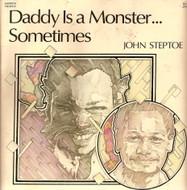
While Barkley Henricks was not my first choice, many works I like and have pizazz. He was a figurative realist with an existentialist flair. (I would have had to convince him to visually flatter me.)
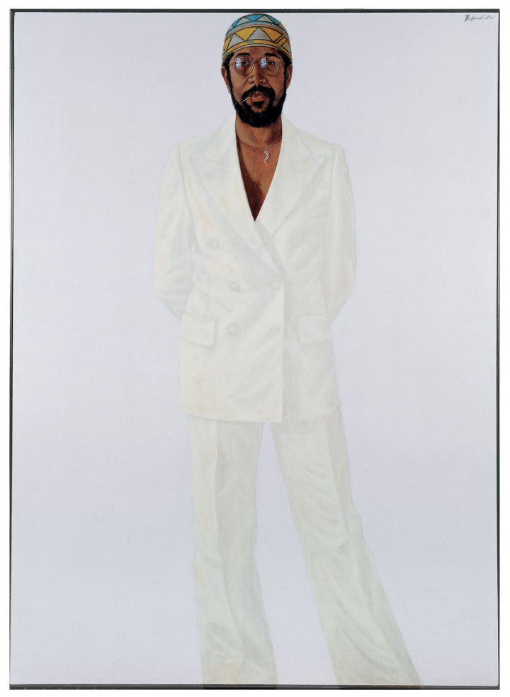 Some of his pieces were strikingly similar to Wiley’s work, including detailed backgrounds and shocking switcheroos. But he died last year.
I’m betting that Simmie Knox’s portraiture is too traditional for the Obamas. From the moment they moved into the White House, they requested contemporary and pop art on their walls. Hillary and Bill Clinton hired Knox for their White House portrait (Nelson Shanks painted the National Gallery portrait). It was a perfect way to expand the stable of American presidential portrait artists while expanding social consciousness. Both Obama and Clinton made political statements by choosing the particular artists they chose. You can “see” their politics.
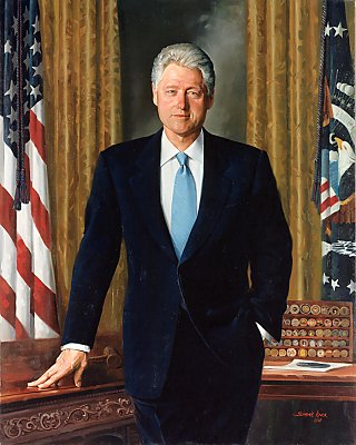
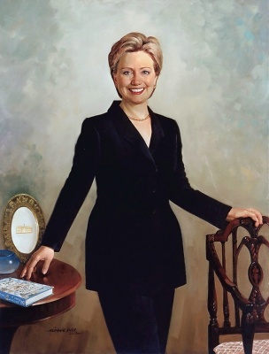
I love the visible brushstrokes in Knox’s work, yet the paintings remain detailed and realistic—the perfect marriage. His portraits make statements about the subjects using color, expression, likeness and surroundings without overkill.
Simmie Knox is humble, traditional (three years in the army), and outrageously talented. “I realize there has never been an African American to paint a portrait of a president and, being the first, that’s quite an honor and quite a challenge,” he told ABC News about painting Bill Clinton’s portrait.
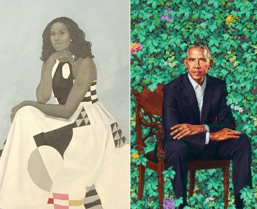
President Barack Obama’s Portrait
Barack Obama’s portrait (scroll up) depicts him seated on a chair against a backdrop primarily of green foliage—leaflets of fives and threes, some smooth and some ribbed, along with a minimal amount of flowers. As described in an article in Popular Science Magazine by Eleanor Cummins, the jasmine represents “Obama’s birthplace and childhood in Hawaii. The pink and gold flowers are chrysanthemums, the official flower of Chicago, where Obama became a community organizer and, ultimately, a senator of Illinois. And the purple flowers are African blue lilies, a reminder of his father, Barack Obama, Sr., a Kenyan man.”
Barack Obama’s portrait looks like him. His nose, his eyes, his lips and ears, the shape of his head. He holds a deceivingly commanding pose, seated and slightly relaxed, legs apart, with his arms crossed on top of his legs, as though he is set to give you a stern lecture. The skin tones are vibrant and blended, if a bit exaggerated (as an acrylic painter, I lean toward Disney-style tones, as well). His people look real.
Secondly, his traditional pose imposed on an imaginary background does not sacrifice the entirety of the portrait. Wiley is a passed master at blending realism with other-than settings. In fact, he got his start painting black, Harlem youth in regal postures wearing the attire of European royalty.
More about Kehinde Wiley and his Work
I love research almost as much as chocolate. So of course I researched while I was writing this article. In some ways, I wish I hadn’t. In my fairytale art world, I imagined Wiley painting every last brushstroke himself. Alas, he hires assistants in China. He also has a studio there. It’s a cost-cutting measure. (http://nymag.com/arts/art/rules/kehinde-wiley-2012-4/)
I have seen Wiley’s work close-up at the Chrysler Museum in Norfolk, Virginia. It is typically large in scale—anywhere from seven to ten feet—and the image I saw was no exception. Although I was attending a poetry reading, the words wending their way into my ears were overtaken by the imagery before my eyes—distracting, engaging, beautiful, thought-provoking.
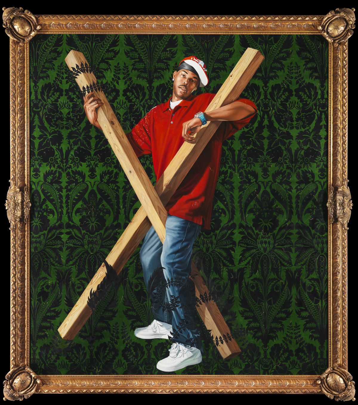 The piece, part of the Chrysler’s permanent collection, is, “St. Andrew,” a primarily green-and-red canvas bisected by an X that represents the cross of St. Andrews, but in the Latin position rather than that of the Roman crucifix. Ivy encircles the ends of the unbleached wood, subtly substituting for rope (rather than nails). The saint is replaced by a black, hip-hop guy wearing a do-rag under a red baseball cap. He straddles the cross in an almost dance-like pose. His gaze is off to the side, in one sense, implying fatigue, and other other hand, decidely dour.
It is a commanding, powerful image, a social statement, and worthy of a wall in a museum. One of Wiley’s most popular images is “Napoleon Leading the Army Over the Alps.” Wiley’s model’s last name, Williams, is carved along with “Hannibal,” “Bonaparte,” and “Karolus Magnus” into the stone beneath the rearing, white steed. The sitter’s name carved alongside three white, European conquerors is one of Wiley’s techniques to weave the common black man into the core of a white, male, supremacist narrative.
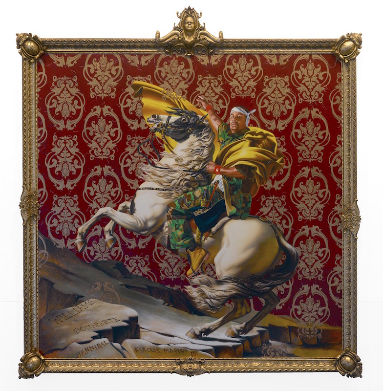 Williams wears camouflage clothing, a white bandanna tied on his head, and a huge, undulating, gold satin cape. The image takes its cue from the neoclassical Jacques-Louis David masterpiece of the same name. In this case, the painting elicited little public outrage because first of all, no one really cares for Napoleon, and secondly, because unless one looks very closely, one doesn’t know to be outraged, or at least, embarrassed. Swimming around the stylized, Baroque flowers are little sperm.
Check out the four corners of the frame, too. Another wily way that Wiley makes a statement about white male dominance.
Wiley’s Fallout— Fame has its drawbacks
Two of Wiley’s pieces came back to haunt him. Curious people Googled his work and came up with “Judith Slaying Holofernes.” Without context, they (two pieces painted in 2012) smack of racism and terrorism. In context, they’re still unsettling. Which was Wiley’s point.
The concept is based on a story in the Biblical Book of Judith. A beautiful widow, distressed by her Jewish countrymen for not trusting God to deliver them from their foreign conquerors, gets an invading general drunk and decapitates him. She returns home with the ruler’s head, and his Assyrian following falls apart. The tale inspired dozens of European paintings depicting the horrific scene. (The 17th c. Dutch cornered the market on biblical horror.)
Wiley recast Judith as a black women and Holofernes—at least, his head—is that of a white woman.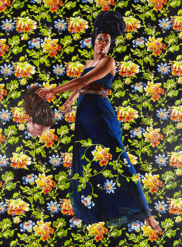
Wiley did a great job on the contrast between the sienna and blues (cobalt and ultramarine) in the version of Judith where his model, Treisha Lowe from Brooklyn, wears a cobalt blue gown belted with leather and gold worthy of equestrian tack. (The same belt is featured in “Mrs. Waldorf-Astoria.”) He is a master of reflected light. He wields hues like a weapon.
The other painting presents Judith as a Capulet, young, powerful and sexy in a sparkly, form-fitting yellow gown. Of the severed head, Wiley told an interviewer from New York Magazine, “She’s one of my assistants.”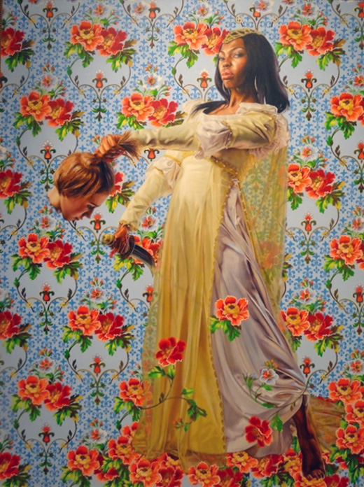
The public was horrified by the impression that their president wanted to destroy white America. I can see that, but, I don’t think that Barack Obama based his choice of Wiley on that image. However, I do think that he chose Wiley for his overall artistic philosophy and illustrative scope.
Critics explained that Wiley had attempted to illustrate how white culture’s appropriation of black culture might be turned against it. At the time he created the paintings, Wiley was more blunt. “It’s sort of a play on the ‘kill whitey’ thing,” he said, referring to a study by David Pizarro, a research psychologist at Cornell.
More